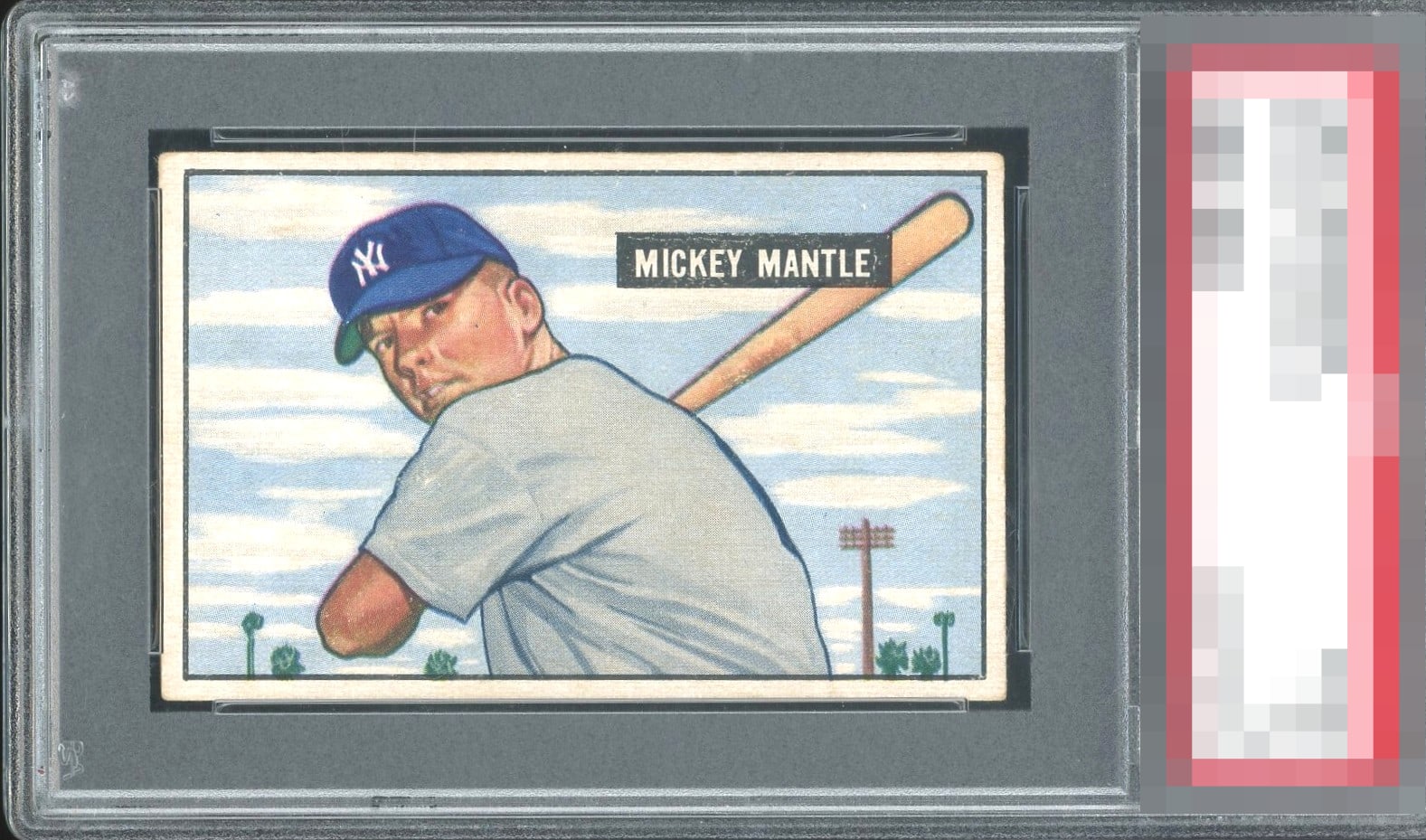
1951 Bowman Mickey Mantle #253

Reviews & Discussions
12 total reviews

Color faint but centering is A and overall eye appeal equal.

EyeBot detects a low-volume centering shift favoring the right, that prevents A+ and God Tier accolades, yet my access to compare functionality reveals this example boasts elite overall centering and visual presentation for the 1951 Topps Mickey Mantle. Corner and wear and white print within his name box are logged, yet create little turbulence for my cycloptic eye. A handsome specimen whose location has been logged for future acquisition protocols. Wink.

The image quality is A+ and the centering is off only enough to warrant the A- badge in my opinion.

This is a very pretty copy with excellent image focus and side centering as the only issue I could see wanting improved. Which would be tough to do.

What a card! If the card was a tiny bit better centered it would be "god tier". Very special copy.

Left/right centering is my only gripe. This is A levels for sure on eye appeal.

This is about as good as the Mantle Rookie gets in terms of eye appeal; if centered better side to side, A+ for me.

Has a tilt and is off center. But I like the centering and size of the borders. Many of these are not as good. Has nice color and strong image. Does have some surface issues and minor discoloring. But I like this card and the overall look

Very nicely centered. The cap is fairly clear and face looks focused. The black name box has some white. Colors are very good.
EyeQ+
EYEQ+ TROPHY CASE
Rating Distribution
12 total reviews
Rare centering. Such a clean card. If the color were a tick bolder, it’d be in contention for GT. Beauty.