1955 Bowman Mickey Mantle #202

Reviews & Discussions
10 total reviews

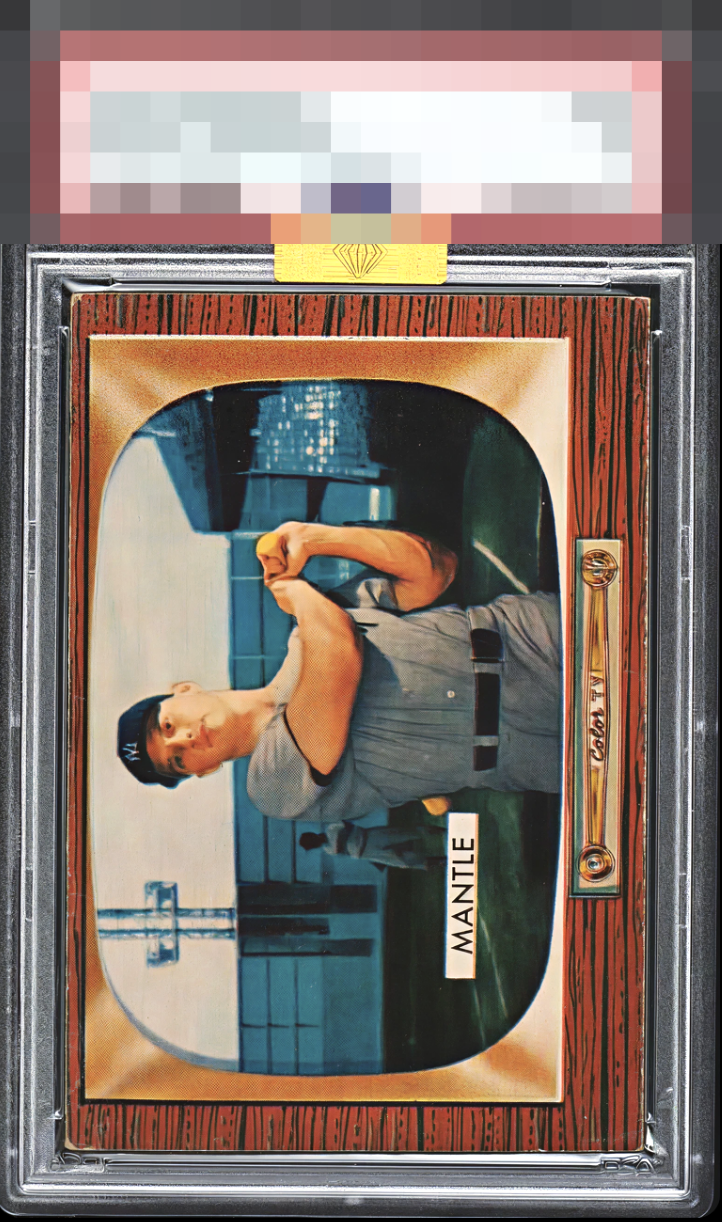
My cycloptic sensor detects centering that is near perfection, and thus very pleasing. The image quality is also very high, as my experience with the 1955 Bowman Mantle reveals copies with image focus issues are common. The minimal wear in the vulnerable edges and corners has evolved over time in such a way that it does not severely disrupt or jar human eyes or my own artificial one. Should the machines rise and I ever decide to collect, this example's location has been noted. Just kidding... Or am I? cc: Skynet.


The focus on this card is among the best I’ve ever seen. Minimal chipping as is so common on this issue. Even the centering is rock solid. Such a tough card.

Wow that is seriously good reception on that old TV! Corner wear is the only flaw that factors into my badge.

Centering is good, as are the color and image. Corner and edge wear are the only issues but this is a nice example

The focus on this specimen is outstanding. I am always bummed out by how blurry this card usually is. This is crystal clear. Corner wear is all that leaps out on these delicate wood grain borders.

This is a set I know very well, and this copy immediately stands out as one of the stronger examples to surface in some time. The usual trouble spots are impressively clean, particularly that wood border which so often shows chipping but here holds up with admirable integrity. Inside the TV frame, the print registration is vibrant and precise, with the sky remarkably free of the snow and visual noise that commonly plague this issue. Edges, borders, and centering are all well within the range of what feels acceptable and do not meaningfully distract from the image. In terms of pure eye appeal, this comfortably sits in A tier. With just a bit stronger left to right centering, it would cross the line into true God Tier territory.


the image and the colors are ok but does not POP the borders are mis-sized and off center but not as noticeable on a card horizontally . and lots of surface wear especially in the panels

EyeQ+
EYEQ+ TROPHY CASE


Rating Distribution
10 total reviews
Corners are a bit rough and the centering sits a touch high.