1963 Topps Mickey Mantle #200

Reviews & Discussions
11 total reviews

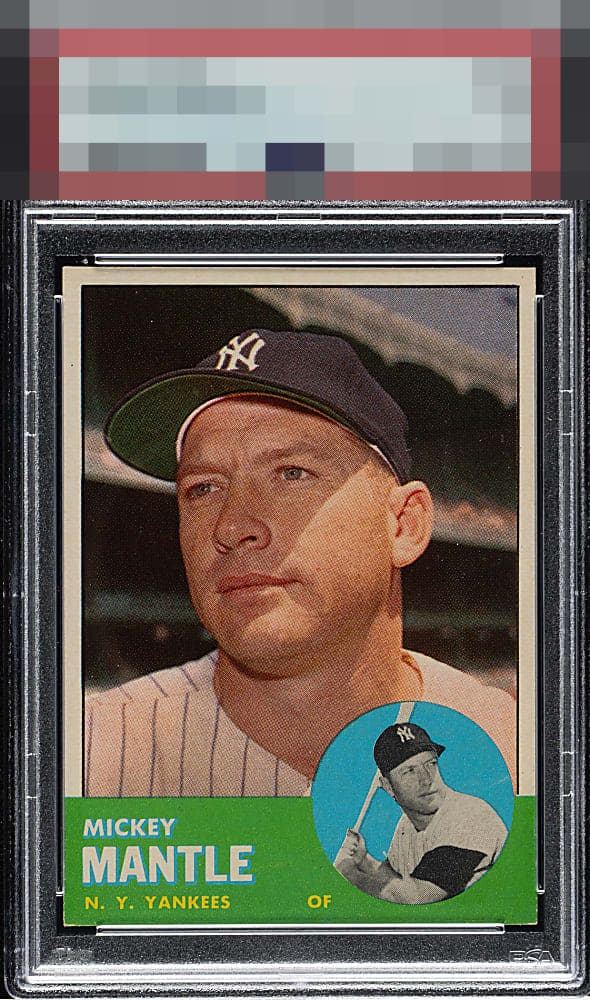
A Beautiful 63 Mick with great eye appeal. Nothing moves this off of A tier for me - only little things keep it from GT: subtle tilt, slight white tips at the extreme ends of the bottom corners.

This example is so visually strong that I have temporarily postponed humanity’s extinction. Just kidding, my human friends. The lone flaw with any volume is corner wear. cc: Skynet.

I really like this one. The colors pop and the centering is flawless. The only concerns are near the bottom of the card. Still a stunner.


I can't see much of anything wrong with this copy. Maybe the slight whiting on bottom right corner, but registration and centering top notch.

This card has it. Centering, perfect blue and green, crisp photo. No corner wear that I care about. A+!

Beautiful! A special shout-out to the clean green and blue areas at the bottom, which are free of the specks and dots that so routinely plague this card. Centering is near perfection.

Well-centered but has a bit of tilt. Very clean image. Presents very well.

card is nice looking and has nice centering and the colors and image are solid. the edges and corners at bottom stand out with damage do to the green/white contrast. minor surface wear but it does blend in nicely
EyeQ+
EYEQ+ TROPHY CASE


Rating Distribution
11 total reviews
Centering may not be perfect but it’s damn close. What is perfect? The deep, unblemished greens and blues. No fish eyes here. Such a primo example.