1963 Topps Mickey Mantle #200
Reviews & Discussions
8 total reviews

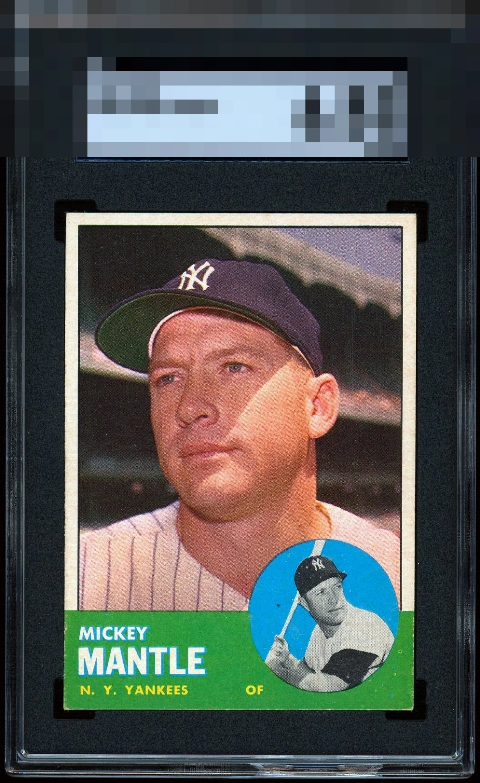
Just a little white in the green nameplate. Otherwise rock solid

Centering looks nearly perfect to me, just the slightest of tilts. Few fisheyes in the green that caught my eye but to me this is overall a very high eye appeal copy of a notoriously tough card.

Only the lower portion of this card keeps it from the top tier of eye appeal as the rest is A++.

The great first visual impression holds even after the flaws emerge-- the flaws that impact eye appeal here are the various PD in the lower right area. Especially the dot in the black. Centering, focus, and PD really plague the 1963 Mantle. This is one of the stronger looking copies.

As good as centering gets on this card! That gets a WOW reaction off the bat. The mark in the blue and some PD in the green are what slightly bump my eye. Top Tier.

Relatively well-centered with a nice focused image. Minor edge wear around the green with some PD. Overall, a pleasing example.

The green box is what catches my eye and hurts the overall appeal of the card. Still a strong card with good appeal but the green box is all nicked up on the borders and edges of it and also surface wear in it. and it stands out to me. and the background also has some snow bur it mostly blends in. Otherwise nice size borders and good centering and nice colors and a strong issue. Sadly the green held it down

EyeQ+
EYEQ+ TROPHY CASE


Rating Distribution
8 total reviews
Besides a few PDs and surface issues, this card is top tier.