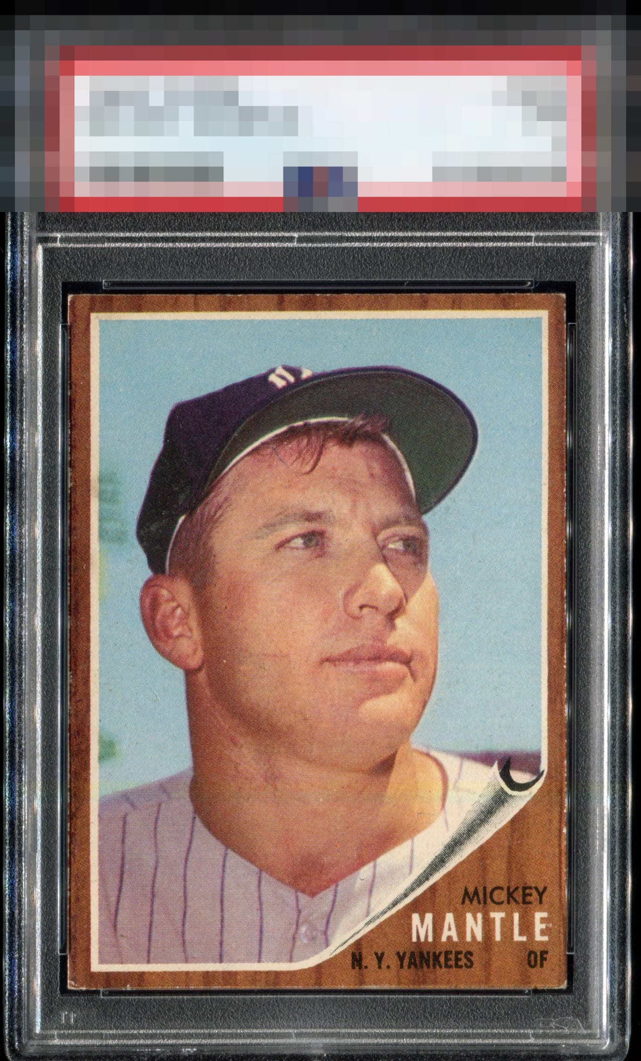
1962 Topps Mickey Mantle #200

Reviews & Discussions
14 total reviews

A tale of 2 sides! Front of the card presents extremely well. Slight edge wear is the only improvement I would like. What a bummer to see the scratches and damage to the backside. Not a fan

As a collector I love the look of the card with emphasis on the front. That back is distracting as to many issues. If someone is a flipper or investor it is best to beware of the back


62s are as bad as 71s. This hits the eye pleasingly, smooth edges, great centering. I see the corner wear. Backs are not my focus at all.


I just think, "Bang for the buck," looking at this card. I really need to look at the back of my 1962 Topps Mick, said no one ever.

Outstanding 1... My favorite! Paper loss on the back holds the technical grade down.. But very clean where it matters aside from the consistent corner wear

Points deducted for the back, but I am really not one who looks at the backs. Nice edges and for a 1 just wow.

I don’t put too much weight on the backs of cards, but this one has too much damage. Front is a solid B.
EyeQ+

EYEQ+ TROPHY CASE


Rating Distribution
14 total reviews
Absurdly nice example on the front. Missing a bit too much paper on the back to get my highest grades.