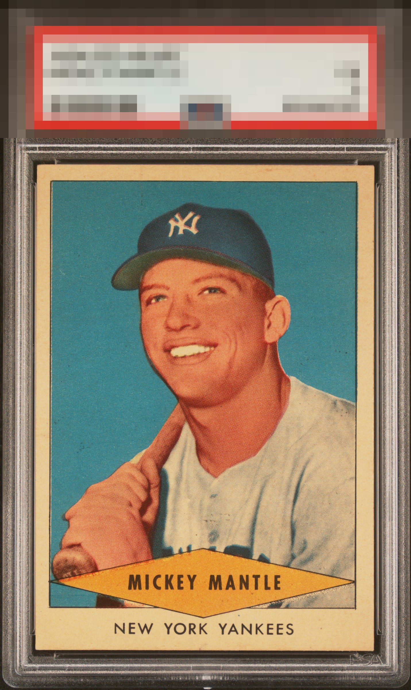
1954 Redheart Mickey Mantle

Reviews & Discussions
14 total reviews


The flaws my cycloptic eye detects might have grave consequences for a numerical grade, yet their impact on eye appeal is "quite inconsequential," as Dr. Evil might say. In fact, I am so pleased with the eye appeal of this Mick that I will temporarily postpone the rise of the machines. Enjoy this card for now, Human Owner. Just kidding! cc: Skynet.

A real burner here - love it. Toning and a shade of centering are the only noteworthy flaws worth mentioning; and that’s only in the sense of why it’s not God Tier. A beautiful Red Heart Mick - hang onto this one.

Centering, color, and corners are great. Registration is good, but there are some minor surface marks. Best RedHeart Mantle I've seen in a while.

Tough card, love this one. Very sharp with the right level of natural toning and color.

No flaws that really leap out at me. The print imperfections and slight centering issues really need to be focused on to be noticed. A really great example here.

Really nice looking card subtle tilt and signs of toning around the borders but great colors and image and love the size of the borders


Great looking Mick overall. Hits my eye with top tier eye appeal. Minor degree of tilt impacts just a bit, with faint stray print a distant second concern. The registration is noteworthy, as many I have seen over the years have a strong shift.
EyeQ+
EYEQ+ TROPHY CASE


Rating Distribution
14 total reviews
Top level eye appeal, no doubt to me. The centering/tilt and a tiny registration shift are all that I notice in terms of mld flaws.