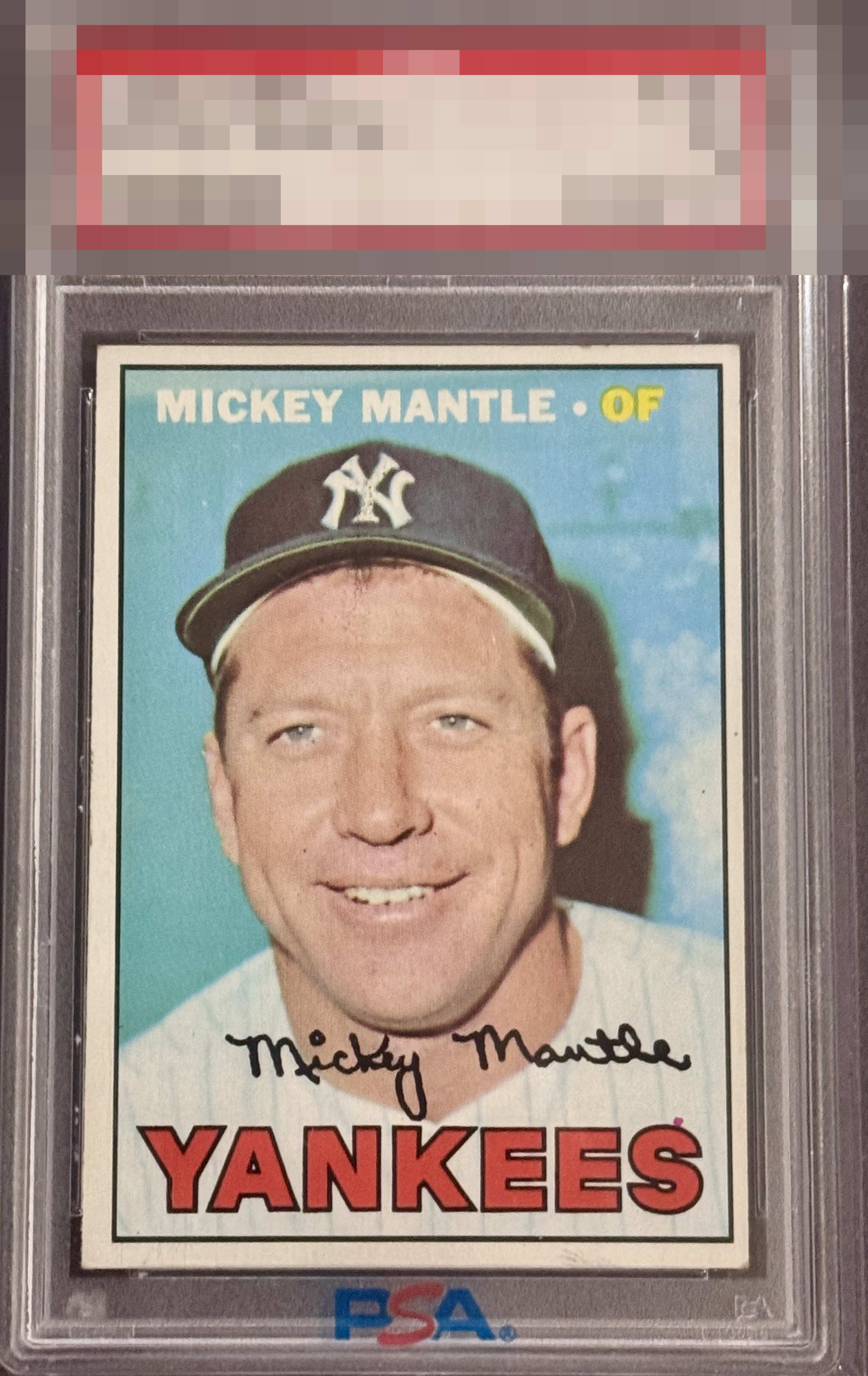
1967 Topps Mickey Mantle #150
1 / 2
Click to enlarge
💬
Reviews & Discussions
4 total reviews


R/L, T/B centering initially catches the eye. The pink print dot over the S, so common on this card, is caught next. White borders have some dark spots. Nice Registration and honest corner wear makes for a nice card of the Yankee legend.

Good eye appeal with the "S dot" imperfection present on many examples. Centering is the one other aspect that impacts.

4 of 7 reviews

0 reviews
EyeQ+
--
Global Population
7
POPULATION ACROSS ALL GRADES AND GRADING COMPANIES
Global Eye Rank
—
No Eye Q+ score
Population in Grade
2
POPULATION IN THIS GRADE ACROSS ALL GRADING COMPANIES
Eye Rank in Grade
—
No Eye Q+ score
EYEQ+ TROPHY CASE

GLOBAL

IN-GRADE
Trophies appear here when earned.
📊
Rating Distribution
4 total reviews
G
0%
A+
0%
A
0%
A-
0%
B+
0%
B
1 rating
25%
1
B-
3 ratings
75%
3
C+
0%
C
0%
C-
0%
D+
0%
D
0%
D-
0%
F
0%
Centering is the main issue. Some edge wear on the top border. Image looks good.