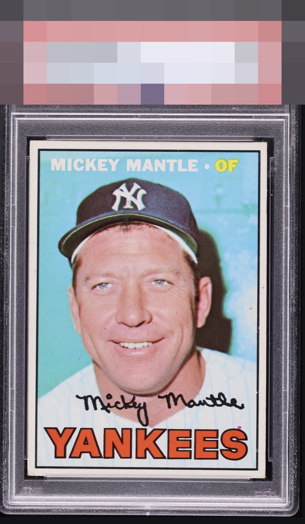
1967 Topps Mickey Mantle #150
1 / 2
Click to enlarge

💬
Reviews & Discussions
8 total reviews


EyeBot notes the print speck atop the 'S' in the team name, which affects a substantial portion of the 1967 Topps Mantles known. This flaw and a modest centering shift adversely affect eye appeal to a mild degree.

Take it and enjoy it. Love the look and the lines of the card and great clarity


Slips into the top tier as centering is solid albeit a touch off, and there are no distractions save the common dot above the 'S' in YANKEES.

Decent eye appeal for me. The centering is close, and the only other thing that catches my eye is the common red dot over the “S.”
Locked
1 review
EyeQ+
132.0
Global Population
7
POPULATION ACROSS ALL GRADES AND GRADING COMPANIES
Global Eye Rank
#2
Population in Grade
1
POPULATION IN THIS GRADE ACROSS ALL GRADING COMPANIES
Eye Rank in Grade
#1
EYEQ+ TROPHY CASE

2nd Place
GLOBAL

1st Place
IN-GRADE
📊
Rating Distribution
8 total reviews
G
0%
A+
0%
A
2 ratings
29%
2
A-
3 ratings
43%
3
B+
1 rating
14%
1
B
1 rating
14%
1
B-
0%
C+
0%
C
0%
C-
0%
D+
0%
D
0%
D-
0%
F
0%
Great centering for a 67 however the dot on the border and just slightly heavier left side holds it back just slightly for me