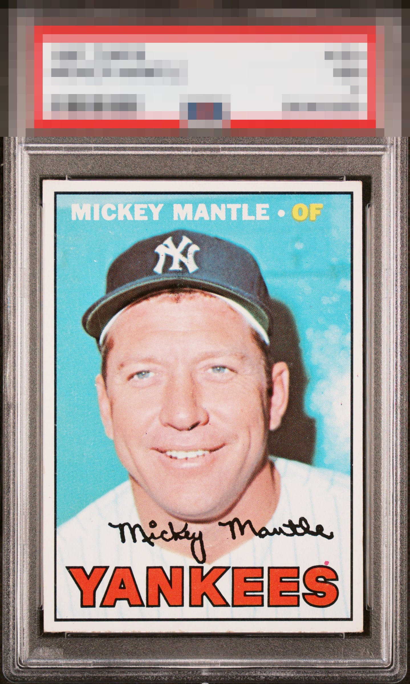
1967 Topps Mickey Mantle #150

Reviews & Discussions
10 total reviews

Very sharp and just a hair off center. Red Yankees pops. The photo of the card looks a bit overexposed. Overall, really nice looking copy.

Clean card and the color looks good. Centering and the red dot are the only issues.

Centering is all that keeps this from the A Zone and the usual dot above the S is a common print flaw I'd try to avoid if I could, but it's on so many of them it doesn't bug me too much.

Top-end eye appeal with just minor flaws like the common dot above the S in YANKEES and a centering lean to the right.

Nice copy. The red print dot and centering keep it out of the A/A+ range for me.

I love oddities and this card has the Red dot above the yes in Yankees. Some says it holds it down I say it drives it up. The card has balanced sized borders but off centered but within my tolerance range. The colors and image are strong And overall the Red dot enhances the appeal of the card


Waffling between B+ and A- here due to centering and the dot. But overall, leaning back and taking it in, it's an eye pleasing card.

Side centering and the quite common dot above the 'S' in YANKEES are the two aspects that catch my eye here. Solid eye appeal in all other respects.

EyeQ+
EYEQ+ TROPHY CASE


Rating Distribution
10 total reviews
Nice color and focus. Fairly decent centering, and if it was a touch better definitely an A grade.