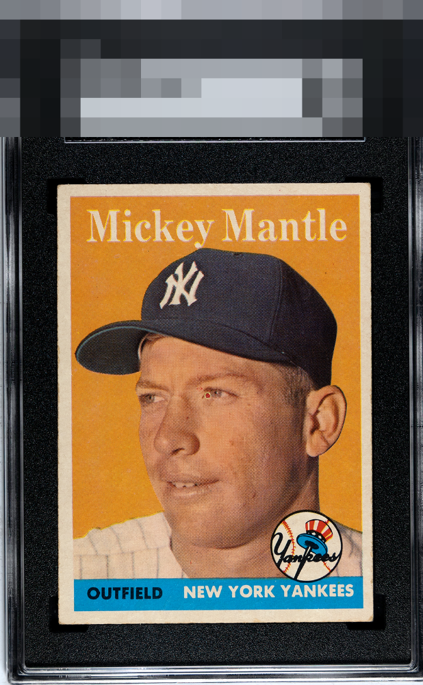
1958 Topps Mickey Mantle #150
Reviews & Discussions
7 total reviews

Bullseye! Unfortunate placement on what looks like a fish eye but the rest of the card looks quite nice to me.

The Baseball Card Gods had to put that PD smack in Mick's eye, didn't they? Eyes are the window to the soul and the center of any portrait card to me, alongside centering. That latter aspect is nearly great, some tilt at the bottom of the side borders. Without that PD this is much, much higher eye appeal it's worth noting, but as is I would stare at the dot too much.

The first thing I notice is the strong colors and the contrast of them. Really nice image The centering is off and the border size are mis matched so they do not frame the card well

The red fisheye on the Mick's eye does distract me. Everything else about the card is fairly blemish free.
EyeQ+
EYEQ+ TROPHY CASE


Rating Distribution
7 total reviews
Have to zoom to find much. Some staining on the reverse but nothing offensive.