1958 Topps Mickey Mantle #150
1 / 2
💬
Reviews & Discussions
7 total reviews


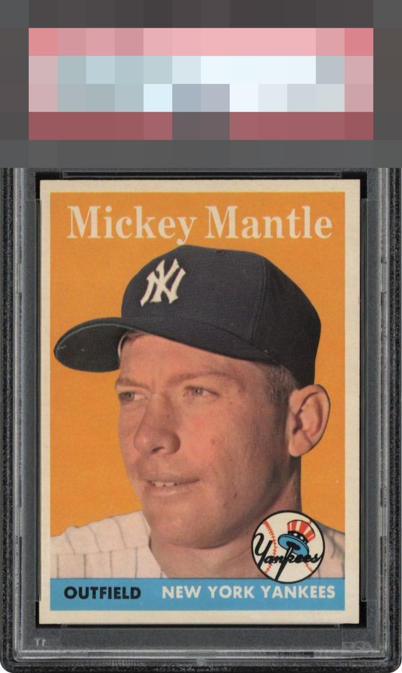
Centering starts this at a B+ for me but then I detect a mild blur to the image which impacts it one more click.

The centering bumps my eye here and I also notice a mark on his cap and do see the image could be a little crisper on the compare function to others.

Colors and Image are solid and it feels like Mantle's Hat is Jumping of the page. The left/Right centering is off more than I like but the borders are clean would liked to have seen them brighter

Looks a touch out of focus. Good color. L/R centering keeps it out of the "A" tiers.
7 reviews

0 reviews
EyeQ+
--
Global Population
13
POPULATION ACROSS ALL GRADES AND GRADING COMPANIES
Global Eye Rank
—
No Eye Q+ score
Population in Grade
2
POPULATION IN THIS GRADE ACROSS ALL GRADING COMPANIES
Eye Rank in Grade
—
No Eye Q+ score
EYEQ+ TROPHY CASE

GLOBAL

IN-GRADE
Trophies appear here when earned.
📊
Rating Distribution
7 total reviews
G
0%
A+
0%
A
0%
A-
1 rating
14%
1
B+
1 rating
14%
1
B
5 ratings
71%
5
B-
0%
C+
0%
C
0%
C-
0%
D+
0%
D
0%
D-
0%
F
0%
Clean and sharp yet centering and focus keep it second tier in beauty.