1958 Topps Mickey Mantle #150
1 / 2
💬
Reviews & Discussions
3 total reviews

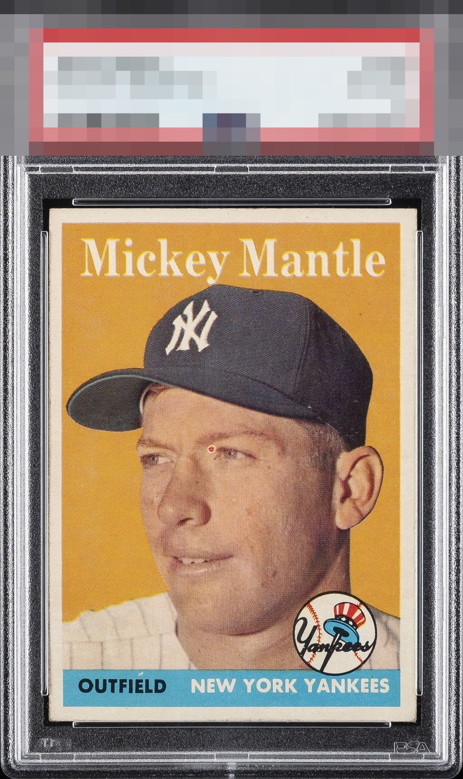
The red print dot by the eye is the first thing I notice. That would always bother me every time I look at the card.

This is a very interesting case study of eye appeal; for me, that dot in his eye just grabs hold of my own eyes and won't let go. On a portrait image card, for me to consider buying it for my collection I need a focused, clean central image and even framing. That dot is in the worst spot it could be, as human eyes are drawn to human eyes in a portrait image. It's similar to when a Red T206 Cobb has the four eyeball appearance. The rest of this card is rather nice yet that one dot in that one place makes it a hard pass for my taste.
3 reviews

0 reviews
EyeQ+
--
Global Population
13
POPULATION ACROSS ALL GRADES AND GRADING COMPANIES
Global Eye Rank
—
No Eye Q+ score
Population in Grade
1
POPULATION IN THIS GRADE ACROSS ALL GRADING COMPANIES
Eye Rank in Grade
—
No Eye Q+ score
EYEQ+ TROPHY CASE

GLOBAL

IN-GRADE
Trophies appear here when earned.
📊
Rating Distribution
3 total reviews
G
0%
A+
0%
A
0%
A-
0%
B+
0%
B
0%
B-
0%
C+
0%
C
1 rating
33%
1
C-
1 rating
33%
1
D+
0%
D
0%
D-
1 rating
33%
1
F
0%
The card with potential that fell short in my eye. Or in Mantle's case Red Eye. The card image and colors are good but has surface issues the card is decently centered but slightly off center and border mis-sized. But the Red dot on the eye is the killer for me. To distracting for me to look past as it is fair sized, almost center of card and color stands out