1956 Topps Mickey Mantle #135
1 / 2

Click to enlarge
💬
Reviews & Discussions
8 total reviews

Bright, sharp, very beautiful card. T/b centering and bit of staining/PD toward the bottom hold it back a bit.

Minor shift is noted and honest corners but bright borders and image. Beautiful example. I like it. Congrats

It presents well to me because the surface issues really are subtle to my eye. Centering actually bumps me more than the surface. Nice card with very good/B+ appeal.

presents well with nice image and colors has some surface wear and centering opportunities holding it back

Image of Mickey looks great. Some soiling towards the bottom middle of the card.

Good eye appeal with centering and some surface blemishes the only issue to my eye.
Locked
1 review
EyeQ+
153.0

Global Population
26
POPULATION ACROSS ALL GRADES AND GRADING COMPANIES
Global Eye Rank
#3
Population in Grade
1
POPULATION IN THIS GRADE ACROSS ALL GRADING COMPANIES
Eye Rank in Grade
#1
EYEQ+ TROPHY CASE
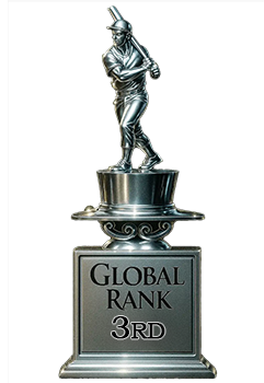
3rd Place
GLOBAL

1st Place
IN-GRADE
📊
Rating Distribution
8 total reviews
G
0%
A+
0%
A
1 rating
14%
1
A-
0%
B+
3 ratings
43%
3
B
3 ratings
43%
3
B-
0%
C+
0%
C
0%
C-
0%
D+
0%
D
0%
D-
0%
F
0%
Really close in all the areas I look for on this card.