1956 Topps Mickey Mantle #135
1 / 2

Click to enlarge
💬
Reviews & Discussions
7 total reviews


This is a really nice 56 Mantle. L/R centering isn't perfect, but there's not a lot to take issue with.

Side centering is all that matters to me here by way of flaw. Great looking card.

Like the overall look of the card but the border size and the off centering is noticeable and holds the grade back. But the nice image and colors makes this card a nice card overall

The face, hat and name/team plates are clear of snow and blemishes which is the first thing I look for. Centering caps the eye appeal grade for me. Nice copy!

Love the colors and image. Surfaces appear to be very clean. L/R centering holds it back.
Locked

0 reviews
EyeQ+
146.0

Global Population
24
POPULATION ACROSS ALL GRADES AND GRADING COMPANIES
Global Eye Rank
#4
Population in Grade
2
POPULATION IN THIS GRADE ACROSS ALL GRADING COMPANIES
Eye Rank in Grade
#1
EYEQ+ TROPHY CASE
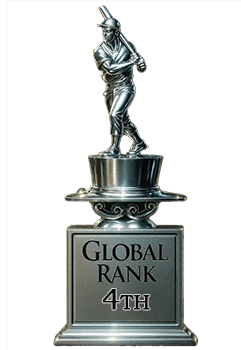
4th Place
GLOBAL

1st Place
IN-GRADE
📊
Rating Distribution
7 total reviews
G
0%
A+
0%
A
1 rating
14%
1
A-
4 ratings
57%
4
B+
2 ratings
29%
2
B
0%
B-
0%
C+
0%
C
0%
C-
0%
D+
0%
D
0%
D-
0%
F
0%
Minor centering shift but thick borders remain with honest corner touches. Nice image and colors. Anyone would love this example.