1956 Topps Mickey Mantle #135

Reviews & Discussions
14 total reviews

My supremely intelligent cycloptic eye is pleased. While mild flaws are detected, they do not cry out attention. If only humans could master such subtle harmony. I have placed this card on my list, for acquisition and safekeeping in the event of any future human/AI conflict. cc: Skynet.

Great card, great colors. Diamond cut jumped out at me but otherwise spectacular.


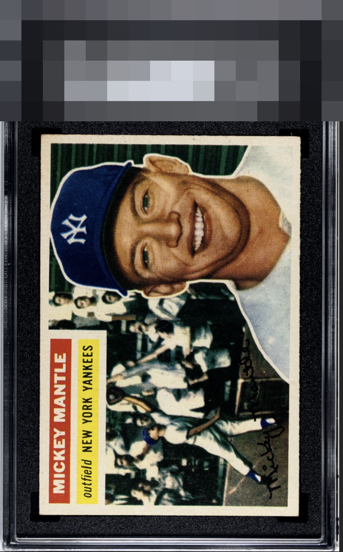
Slight centering tilt but this card presents very well. Very clean and well focused.

Beautiful example. The ONLY thing that holds it back a bit to my eye is the slight slope of the bottom border. Otherwise for me this is a GT-level card.


Love the card and the overall look of the card. The images and colors are strong. Loses it on the slight slant and what appears to be light discoloration on the top right (especially noticeable on the borders) But overall a Great Card I would be proud to put in my collection

There is a mild slant to the bottom centering— and that is all I got in terms of critique here. The overall eye appeal is lights out. Bravo. This is the sweet spot, for me, as a collector. Why ever pay more for 8s when a card like this is out there to be hunted and secured.
EyeQ+
EYEQ+ TROPHY CASE


Rating Distribution
14 total reviews
Tilt normally kills eye appeal for me but it is so slight and the rest of this card is simple glorious.