1956 Topps Mickey Mantle #135

Reviews & Discussions
16 total reviews

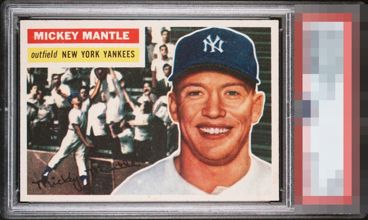
This is my perfect kind of card, centered, white boarders, beautiful front with a messed up back, I'll take that all day long.

Incredible front. The exact card I’d pursue. Beautiful where it matters. Some paper loss on the back which means very little to me.

I don't really look at backs much, yet will acknowledge the back damage by taking a flawless front viewing experience and knocking it down one peg.

Front looks incredible, but the back is bad enough that it significantly hurts the eye appeal for me.

Forgetting the back for a second, unfortunately, the white marks in the hat jump out at me so much which makes me sad. This is an A+ front except for the white marks. The back is a disaster to the point even I cannot ignore it.


This has to be the best value buy 1956 Mantle in the hobby. Sure the back is a mess, but man from the front this is a stunner.

front looks really nice from the centering to the colors. The back of the card is really bad condition

Wow, look at that front! Centered, sharp and super-clean. Remarkable for the grade. Downgraded only for the issues on the back, including fairly heavy paper loss which includes some loss of text.
EyeQ+

EYEQ+ TROPHY CASE


Rating Distribution
16 total reviews
A 1956 Mantle that’s so pristine it might just fool you into thinking it’s a 2020 reissue. The centering isn’t absolutely perfect, but it’s so close you’d have to squint to find a flaw. The imagery? Fantastic, like a classic film still in perfect focus. And sure, the back’s a little fucked, but let’s be honest: who’s flipping it over anyway?