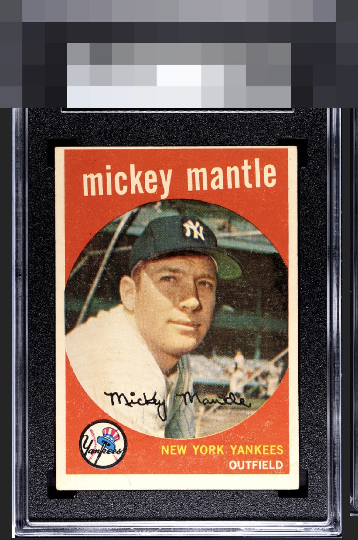
1959 Topps Mickey Mantle #10
1 / 2
Click to enlarge
💬
Reviews & Discussions
8 total reviews


The T/B shift is kind of harsh and some faded areas in the red can distract some, but the side to side framing keeps the card in an attractive eye appeal range for me.


centering and odd border size are off alot more than i like and it effects the overall appeal of the card. A shame as the colors and image are good (but limited by the speckles on the Red)

Centering is the lone severe aspect, with surface patina trailing behind. The rest of the card is in the higher tier and provides a good counterbalance.
Locked
1 review
EyeQ+
124.0
Global Population
23
POPULATION ACROSS ALL GRADES AND GRADING COMPANIES
Global Eye Rank
#8
Population in Grade
1
POPULATION IN THIS GRADE ACROSS ALL GRADING COMPANIES
Eye Rank in Grade
#1
EYEQ+ TROPHY CASE

8th Place
GLOBAL

1st Place
IN-GRADE
📊
Rating Distribution
8 total reviews
G
0%
A+
0%
A
0%
A-
0%
B+
0%
B
0%
B-
2 ratings
29%
2
C+
1 rating
14%
1
C
2 ratings
29%
2
C-
2 ratings
29%
2
D+
0%
D
0%
D-
0%
F
0%
My cycloptic eye finds a rather pleasing image impacted by uneven framing and mild print "snow." The assessment is eye appeal of an average order.