1959 Topps Mickey Mantle #10
1 / 2
💬
Reviews & Discussions
6 total reviews

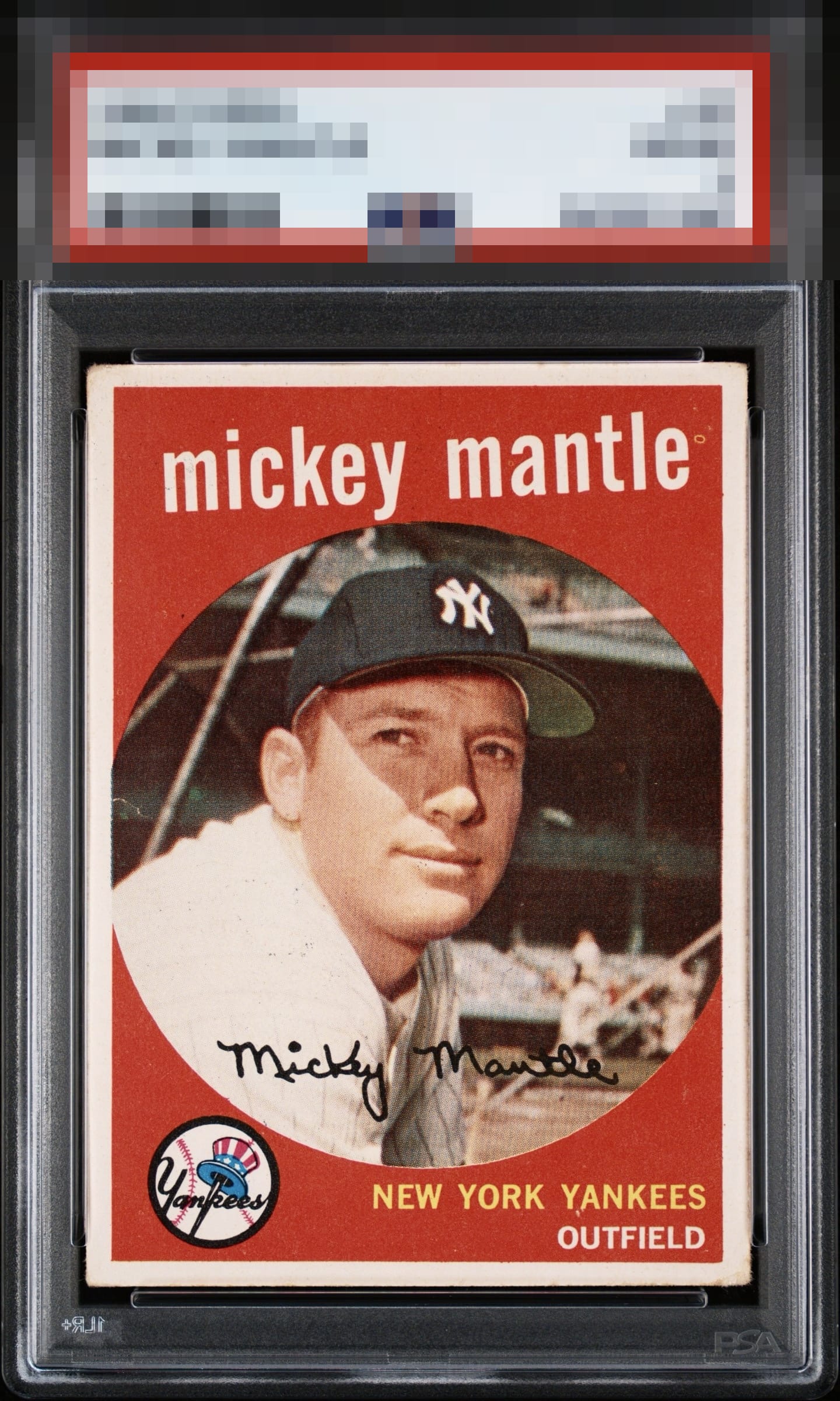
Elite centering and focus; the image on this one can be sneaky blurry, when compared to the focused copies, One prominent fish eye and the top left/lower right corners make a modest impact on eye appeal.

some minor surface wear on the red background like below the Yan in Yankee and to the right of the E in mantle on top are all that hold it back to me. Centering is off but not enough to effect the look and the colors and image are sharp

Love the color and centering. Fisheye on the upper left in the red and a surface issue on the left middle near the border.

5 reviews
1 review
EyeQ+
--
Global Population
17
POPULATION ACROSS ALL GRADES AND GRADING COMPANIES
Global Eye Rank
—
No Eye Q+ score
Population in Grade
1
POPULATION IN THIS GRADE ACROSS ALL GRADING COMPANIES
Eye Rank in Grade
—
No Eye Q+ score
EYEQ+ TROPHY CASE

GLOBAL

IN-GRADE
Trophies appear here when earned.
📊
Rating Distribution
6 total reviews
G
0%
A+
0%
A
1 rating
20%
1
A-
2 ratings
40%
2
B+
2 ratings
40%
2
B
0%
B-
0%
C+
0%
C
0%
C-
0%
D+
0%
D
0%
D-
0%
F
0%
Rare centering