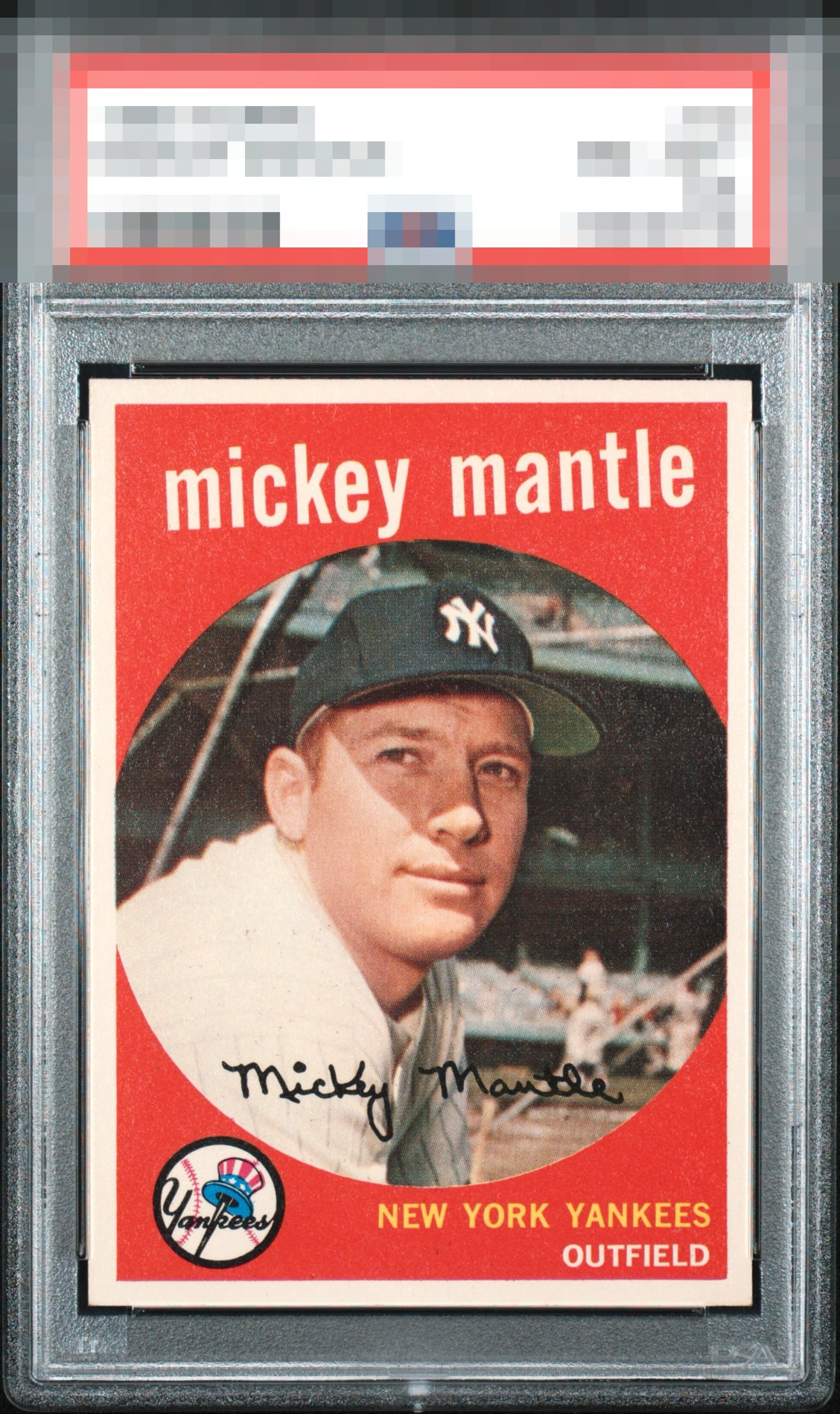
1959 Topps Mickey Mantle #10
Reviews & Discussions
9 total reviews

Only a little snow and tilt for me. Looks pack fresh besides some slight toning on the back. Looks expensive!

Just a beautiful card. Nothing rises to the level where it's worth even noting, to my eye.

Very strong example. Centering is good but slightly off with a small tilt. A little snow is also noticeable in the background but this would be good enough for me.

Great eye appeal with top border tilt and faint but still visible snow the only flaws worth citing.

nice entering but a bit off and a slight tilt but the borders are so clean and bright and frame the card well. THe colors and image POP. Great Card for anyone to enjoy


Love the color and image. Subtle tilt and some snow in the background. Presents very well.

Clean color unaffected by time, nearly perfect centering, and the corners and edges are in that "fresh out the pack" zone. No print imperfections either in the red, which will kill eye appeal for me. Mild tilt in the top border is the only flaw I notice.

EyeQ+
EYEQ+ TROPHY CASE


Rating Distribution
9 total reviews
Bright, clean white borders give this card immediate pop, and the print registration is impressively crisp. Centering is excellent, which keeps the presentation balanced and confident. The lone distraction is a slight left tilt, most noticeable along the top red where it meets the white border. Overall, this is an excellent example.