1959 Topps Mickey Mantle #10
1 / 2
💬
Reviews & Discussions
6 total reviews

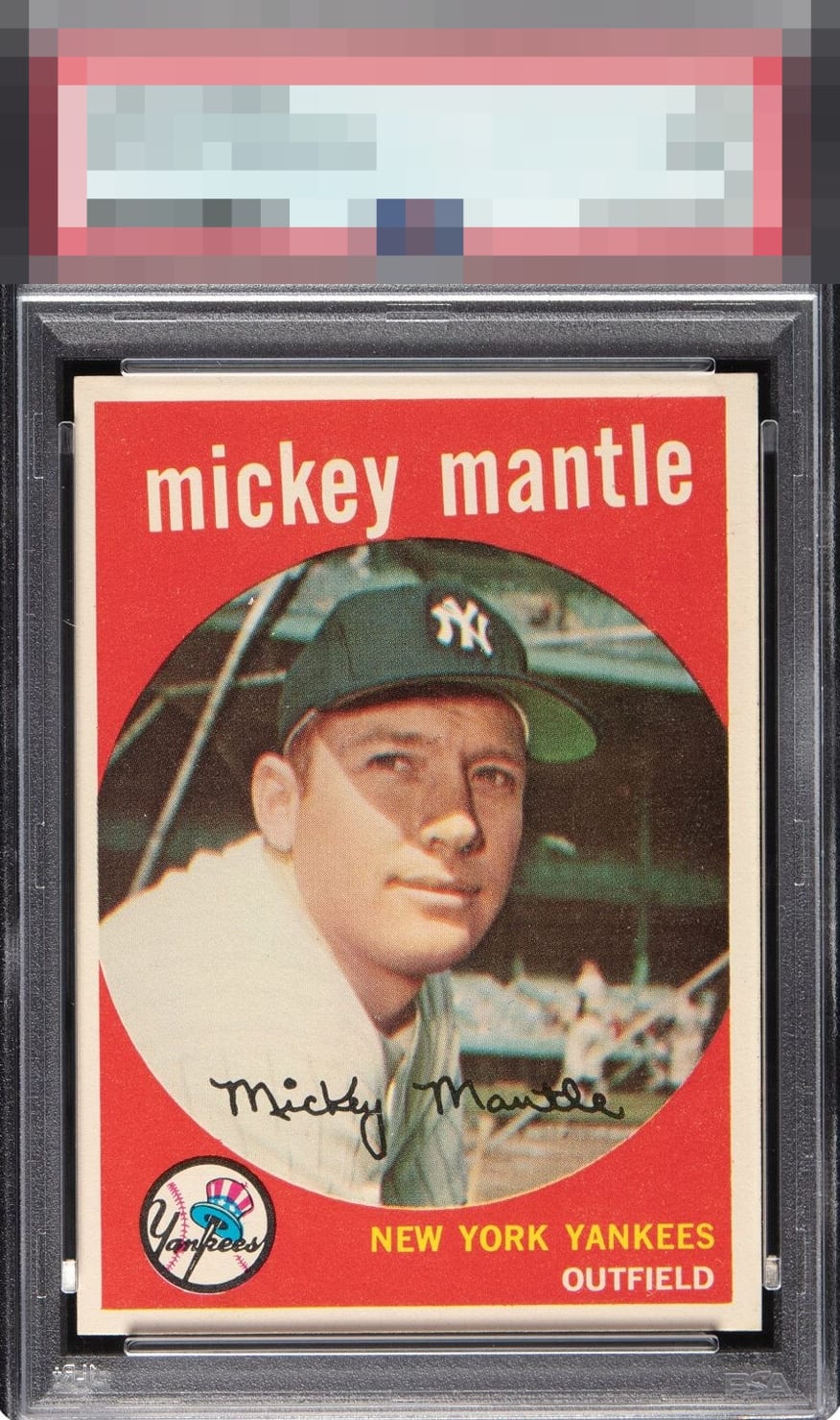
Horrible copy for the grade. Old label PSA certs are a joke. That centering is garbage.

Corners, edges, and borders look good. Colors are strong and image is solid. Loses it on the card being off center

For me, the key determinants of eye appeal are central image quality and then centering. This card, though sharp cornered, with solid red, and a clean image, is just dragged down into the deep because of that brutal centering and tilt. I would not want this to be the one I'd be looking at in my collection for keeps. Pass.
4 reviews
2 reviews
EyeQ+
--
Global Population
17
POPULATION ACROSS ALL GRADES AND GRADING COMPANIES
Global Eye Rank
—
No Eye Q+ score
Population in Grade
4
POPULATION IN THIS GRADE ACROSS ALL GRADING COMPANIES
Eye Rank in Grade
—
No Eye Q+ score
EYEQ+ TROPHY CASE

GLOBAL

IN-GRADE
Trophies appear here when earned.
📊
Rating Distribution
6 total reviews
G
0%
A+
0%
A
0%
A-
0%
B+
1 rating
25%
1
B
0%
B-
0%
C+
3 ratings
75%
3
C
0%
C-
0%
D+
0%
D
0%
D-
0%
F
0%
too off centered for the grade