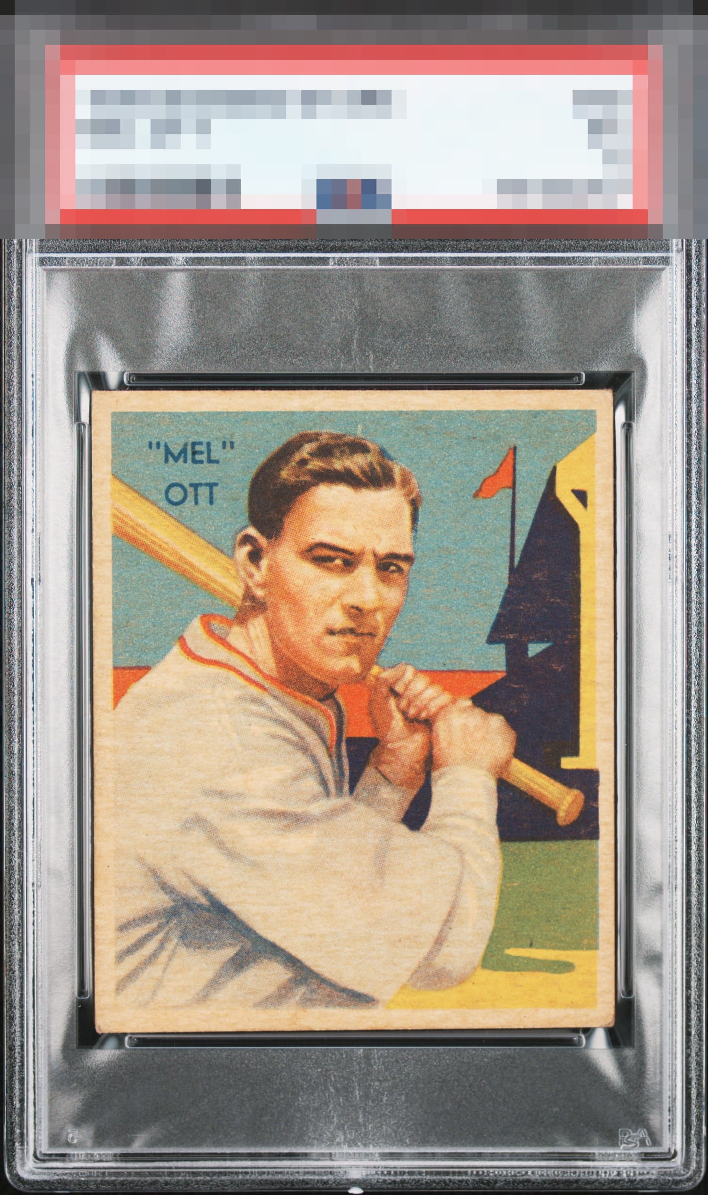
1935 National Chicle Mel Ott #50

Reviews & Discussions
6 total reviews

Nice overall eye appeal here. What looks like a bit of toning, most noticeable on the right side against the black but it doesn’t bother me much or distract from the great color and crisp image.

High eye appeal with corners being the only noticeable flaw to my eye.

Solid example with just a bit too much toning to enter into the A range for me, but this definitely looks better than the technical grade.

The card looks good. There is some discoloration on the top but it actually blends into the card and is not dramatic. The main image and colors are good but do not POP. The card has nice size borders and good centering and the corners are in better shape than many of these cards I see. The borders are clean but discolored


EyeQ+
EYEQ+ TROPHY CASE


Rating Distribution
6 total reviews
Very solid mostly square borders & clean image