1985 Topps Mark Mcgwire #401

Reviews & Discussions
11 total reviews

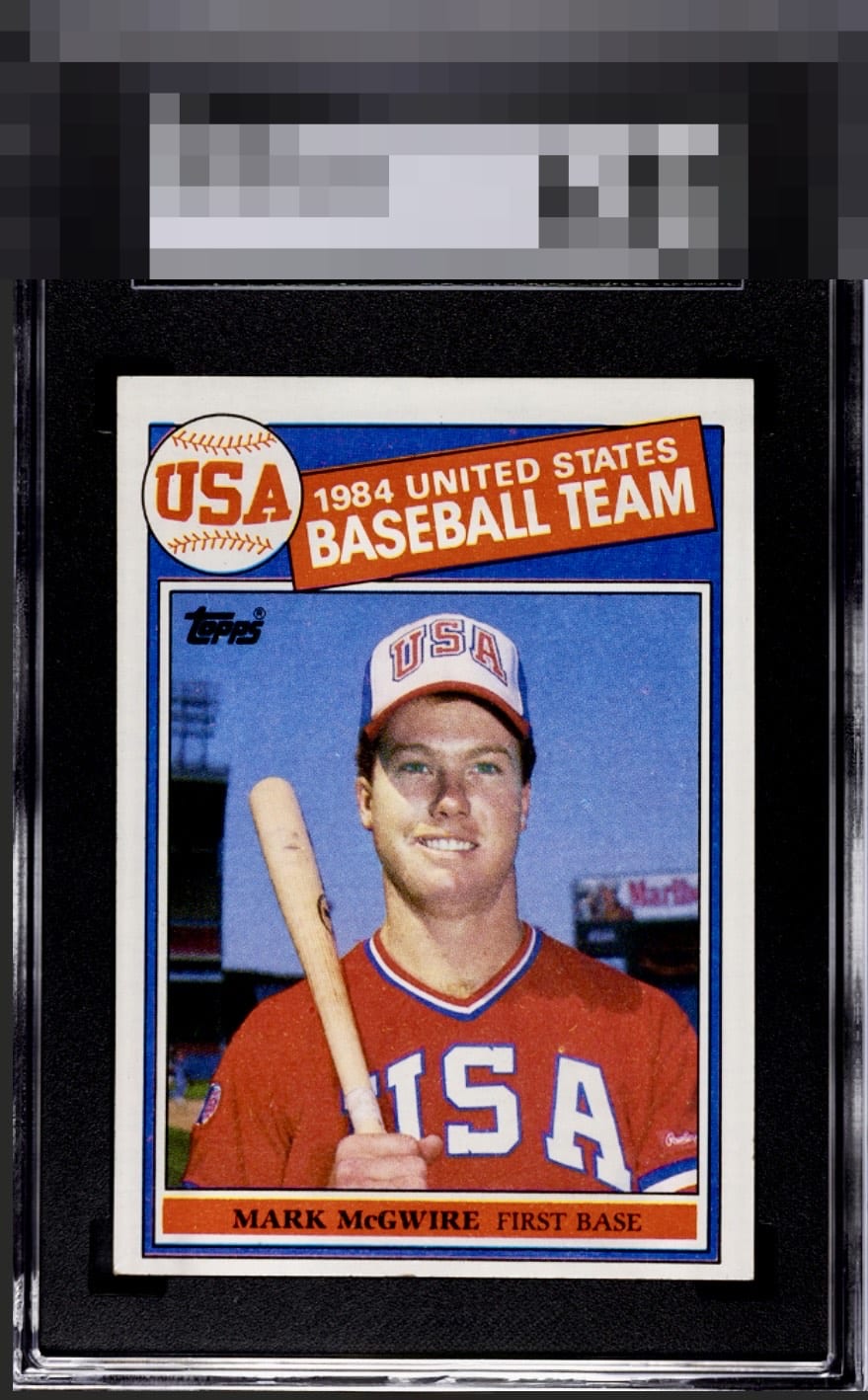
Nice looking iconic McGwire card. It retains good color, sharp corners and clean edges. The centering is the biggest drawback for me as it sits low. In addition, I see a few distractions on the surface. McGwire shows up well here though as the blues and reds pop nicely


Card is OC in all ways and has some surface damage. The color is there but it's off centering is too prominent.


Color and image are God Tier, centering then takes it down from there. Still lands in B Tier to me.

Centering and tilt caught my eye off the bat. The rest of the presentation is solid.


I love when this card has the color that this one exhibits, yet the centering being so low also brings the eye right to the one spot of edge wear in the center of the bottom edge, which does adversely affect the eye appeal.

The borders bother my eyes. 4 Different sizes plus a tilt and it makes the card look off. The colors and image and brightness of the card is good but the Centering issues is to much for me and drags the card down
EyeQ+
EYEQ+ TROPHY CASE


Rating Distribution
11 total reviews
T/B centering is the biggest issue, but the card is almost oversaturated - which can cut both ways.