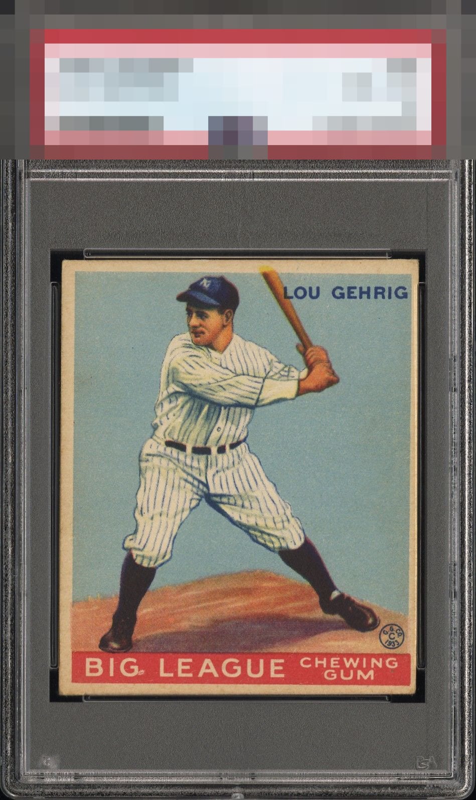
1933 Goudey Lou Gehrig #92
Reviews & Discussions
10 total reviews

Holistically, this is a really nice example of the card, one I’d own in a heart beat. The surface is really clean, and on a 33 Goudey, that is the important thing to my eye. The left/right centering is immediately noticeable, and staring a bit longer reveals the slight top/bottom tilt. There is also some slight registration on the image of Lou, but most noted by the bat bleeding into the border. The corner wear is there, but doesn’t really bother me.

Registration trumps centering for me on Goudey's. Looks like a nice copy to me.


If not for the tilt I would likely be able to overlook the left right centering shift due to an incredible central image.

Strong colors with a focused image. Off-centered with tilt. Good looking card but centering keeps it from the "A" tiers.

For me, it’s all about the facial detail and color from this set and this card has both going for it. Held back slightly by centering.

Nice looking card but the card shows coloring from aging. The borders are small on 2 sides and off center. But the main image and the colors are still nice

Image looks great, centering, tilt, and surface wear keep this at a B tier for me.

Despite the centering I am going top echelon eye appeal because the detail in his image is so pleasing, as is the surface and color.

EyeQ+
EYEQ+ TROPHY CASE


Rating Distribution
10 total reviews
The centering made me think solid B at first, but this card is really sweet in almost all other respects and so it pleased my eye to the tune of a B+ on a longer look.