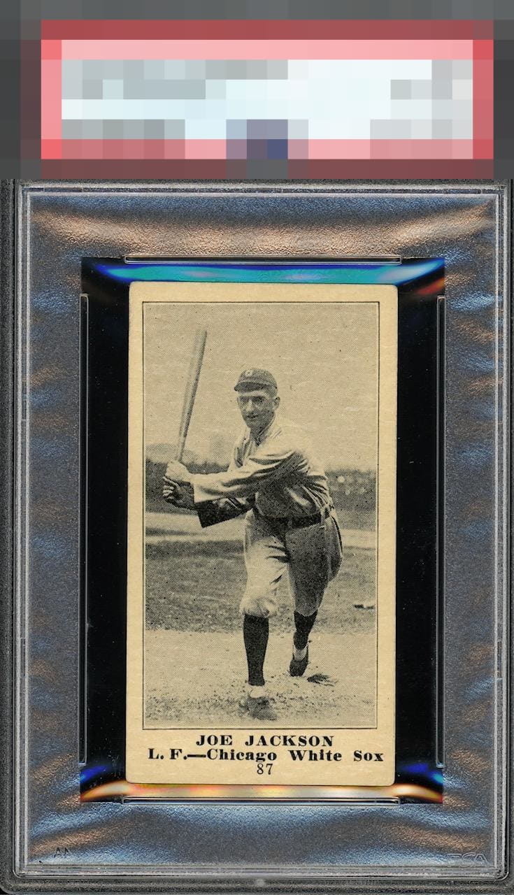
1916 M101-4 Gimbels Joe Jackson #87

Reviews & Discussions
13 total reviews


Some flaws but easy for me to overlook when including context on a card of this magnitude. More so than the centering and tilt, there's some wear around the face area

Such an iconic image and an important card. I see the tilt like everyone else, but it does not bother me much, and I’ve seen much worse M101s from a centering and tilt standpoint. This is a very attractive example to my eyes despite the obvious flaws.


Diamond cut cards are a big eye sore for me. Cool card, but not a visually stunning copy.

GReat looking card from how clean it is and the nice bold borders. The back is amazing also. The issue is the centering/tilt of the card and can be especially seen on the top left corner. But overall the WOW factor

I like what that other review says abou this card. It has an aura. Reminds me of Chappelle's show seeing Rick James' aura. Maybe the third most "classic" baseball card player image after Wagner portrait and 52 Topps Mantle.

This card carries an aura of God-tier quality. Perfectly balanced centering, crisp print registration, and corners that defy the passage of time. For a 1916, it simply doesn’t get much better than this. Welcome to HOF eligibility and welcome to God Tier.

109 years old and looks nearly as it did the day it was first held by some lucky kid! Sure, I see the tilt yet the famous pose is what holds my attention here; the image contrast is wonderful and the entirely blemish-free presentation is just beautiful. I would buy this card in a heartbeat and never once think of replacing it-- not that another could even be found! Usually, with this level of rarity, one has to make eye appeal concessions. That not being the case here makes this card especially noteworthy.
EyeQ+
EYEQ+ TROPHY CASE


Rating Distribution
13 total reviews
Wow, such a special version of this card. Docking it for being a little off centered but it is a beauty.