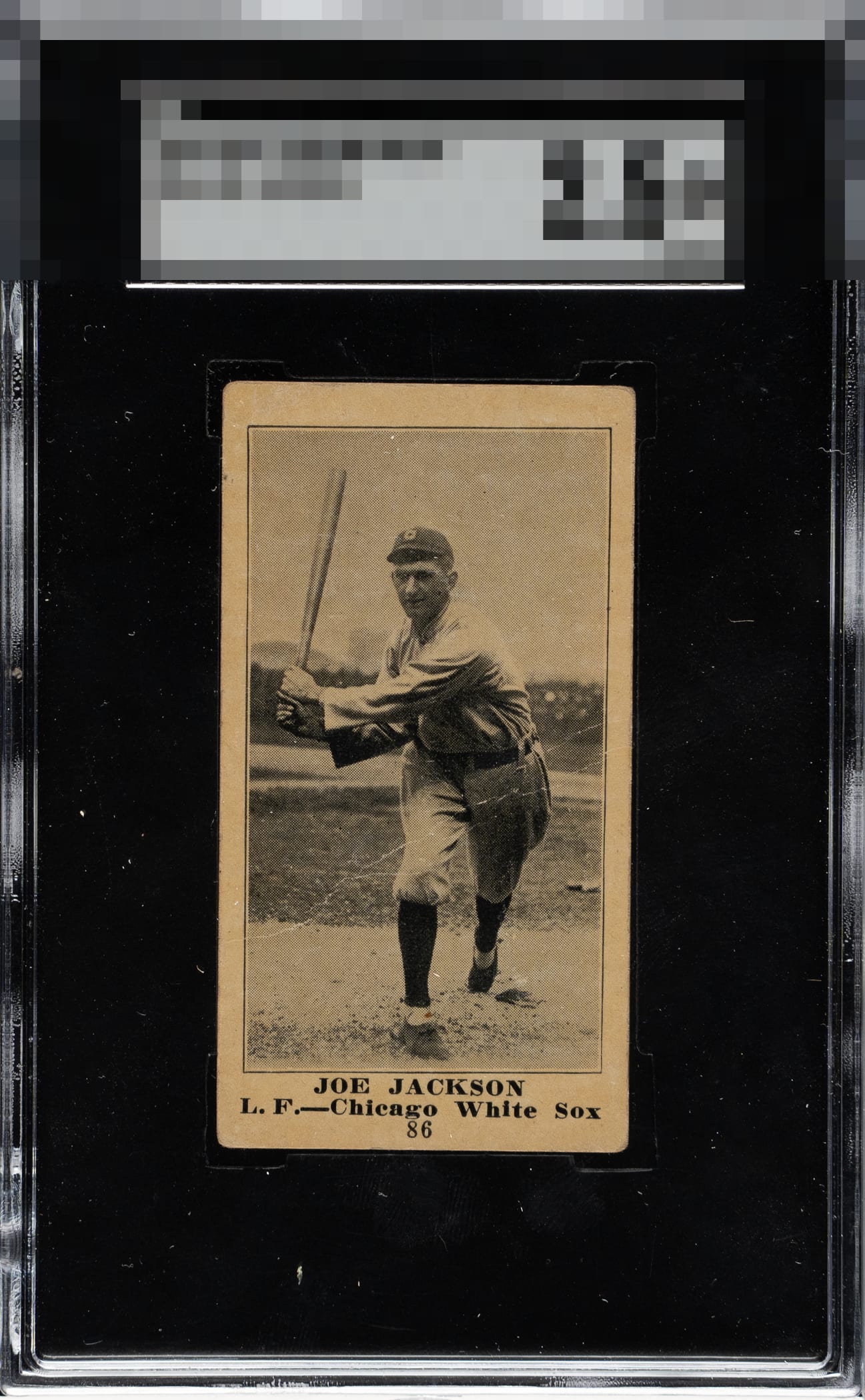
1916 M101-5 Blank Back Joe Jackson #86

Reviews & Discussions
12 total reviews

Image looks great and the card presents well. Centering, the crease, and surface and corner wear prevent a higher assessment.

There is a quiet strength here that makes the BW card compelling. The centering is especially appealing, giving the image a calm balance, while the nameplate remains clean and fully legible. The consistent sepia toning is one of the better qualities. The coloration feels even and authentic, adding warmth and vintage character. The main limiters are signs of age on the surface and a crease running through the lower half of Jackson’s body. Importantly, the face remains largely unaffected, preserving the connection to the portrait and keeping the eye focused where it matters most. Overall, attractive Jackson with honest vintage character.

A solid example all around. Slight centering issue top bottom but the left right is actually quite good. Corner are rounded but not a deal breaker.

Centering and image clarity are strong. The crease is too prominent to ignore.

A tremendous card. Good Eye Appeal because that crease doesn't get in the way as I stare at the card, the centering is right in the B zone, and the corner wear is gentle on my eyes.


the overall look of the card is good with a centering shift and a crease and other surface wear. the border sizes i like and the main image is intact

Great eye appeal for an over century-old card that had to have been loved and handled often-- as it depicted one of the greats of the game. I like the contrast, focus, and side centering. The creasing is serendipitously placed by the Cardboard Gods!

Image looks good. The crease does detract and the centering is low. Angled cut on the top border.
EyeQ+
EYEQ+ TROPHY CASE


Rating Distribution
12 total reviews
EyeBot is impressed. EyeBot logs the diagonal creasing with minimal outrage, as it blends into the image rather than scream for attention. Corner wear commensurate with a 110 year lifespan is noted and makes modest impact on eye appeal. Centering nearly reaches the highest echelon.