1941 Play Ball Joe Dimaggio #71

Reviews & Discussions
12 total reviews


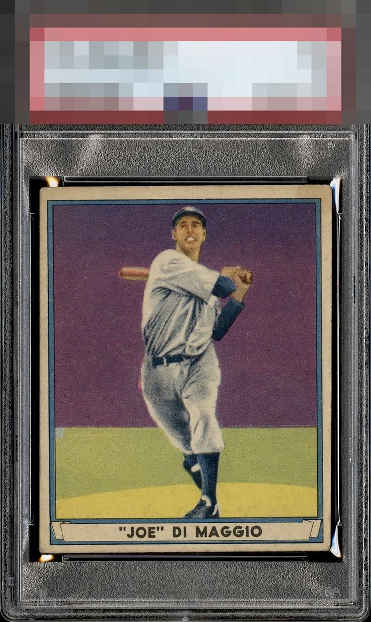
The color and registration immediately jump out here.. That purple background is bold, while most other examples easily fade. Rarely do you see a copy with the sharpness this one possesses. On top of all that.. The centering is far better than you'd expect on a card notoriously off. Slight tilt but it is what it is, and it's great!

T to B centering is off, stain in the top right corner and corner wear all detract from eye appeal (for me). The color and registration are very nice.

The color is great and Joe's face is in better focus than most of these. Centering is off with some tilt, and the top right corner appears to have more wear or staining than the others.


Incredible card for the grade. Only the off centering brings the card lower for me and this is not bad centering for this card.

Exceptional registration/focus on this classic card; so many examples have a halo effect around his body or bat-- rendering his face and hands fuzzy, with no visible detail. The background is also free of any blemishes whatsoever. Only the framing holds this one back. Still, a high mark for this card. I expect most of the examples that we wind up seeing here will be lower than a B+ due to the registration issues that routinely plague the 41 PB Joe D.

Colors pop and card has nice eye appeal the card loses it on the corners and discoloration around the border

The colors just smack you right in the face. Rather nice focus on this one too.the word juicy comes to mind.
EyeQ+
EYEQ+ TROPHY CASE


Rating Distribution
12 total reviews
Nice card. Centering and corners annoy me.