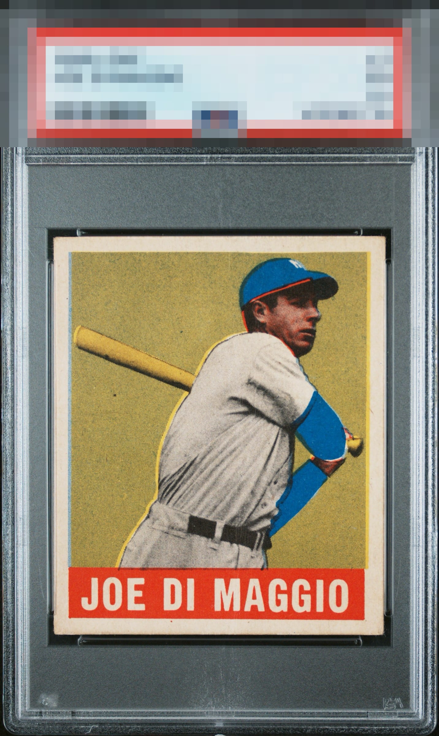
1948 Leaf Joe Di Maggio #1
1 / 2

💬
Reviews & Discussions
7 total reviews


A small centering and registration shift are the two flaws that make an impact, yet the overall impression is certainly in the top level for me.

The registration looks a bit off to me and distracts my eye slightly. I really like the red in the nameplate.

The card is clean with no surface issues and bright white borders. Centering is a little off with a tilt but not too bad. The registration is off though and it distracts a little.

Really nice looking card. It is clean and solid looking with strong image and colors. The border sizes are nice but the centering is a bit shifted

Colors and centering are on point. The registration shift does hurt the eye-appeal for me.
7 reviews

0 reviews
EyeQ+
--
Global Population
4
POPULATION ACROSS ALL GRADES AND GRADING COMPANIES
Global Eye Rank
—
No Eye Q+ score
Population in Grade
1
POPULATION IN THIS GRADE ACROSS ALL GRADING COMPANIES
Eye Rank in Grade
—
No Eye Q+ score
EYEQ+ TROPHY CASE

GLOBAL

IN-GRADE
Trophies appear here when earned.
📊
Rating Distribution
7 total reviews
G
0%
A+
0%
A
1 rating
14%
1
A-
3 ratings
43%
3
B+
0%
B
3 ratings
43%
3
B-
0%
C+
0%
C
0%
C-
0%
D+
0%
D
0%
D-
0%
F
0%
Some may ding this for the clear registration shift but personally I love the variations found within the 48-49L. This one looks unique - almost intentional - with great color and centering. It’s got character. Love it.