1968 Topps J.koosman/n.ryan #177
1 / 2

💬
Reviews & Discussions
6 total reviews

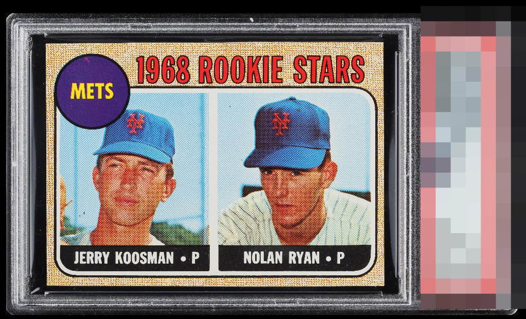
Very strong and well centered copy with great focus and registration.

I Love how the borders look and how well they held up. As they normally nick and then looses its appeal. Overall the card really looks good and a card I would be proud to own

Very well-centered with nice colors. A few minor blemishes in the background and the purple. This is a beautiful example.


This is fantastic eye appeal. Clean black nameplates. Focused faces. Just a blemish in the team circle from and a little centering from A+. Bravo.
6 reviews

0 reviews
EyeQ+
--
Global Population
6
POPULATION ACROSS ALL GRADES AND GRADING COMPANIES
Global Eye Rank
—
No Eye Q+ score
Population in Grade
2
POPULATION IN THIS GRADE ACROSS ALL GRADING COMPANIES
Eye Rank in Grade
—
No Eye Q+ score
EYEQ+ TROPHY CASE

GLOBAL

IN-GRADE
Trophies appear here when earned.
📊
Rating Distribution
6 total reviews
G
0%
A+
0%
A
2 ratings
33%
2
A-
3 ratings
50%
3
B+
1 rating
17%
1
B
0%
B-
0%
C+
0%
C
0%
C-
0%
D+
0%
D
0%
D-
0%
F
0%
Mostly clean with a bit of a typical tilt.