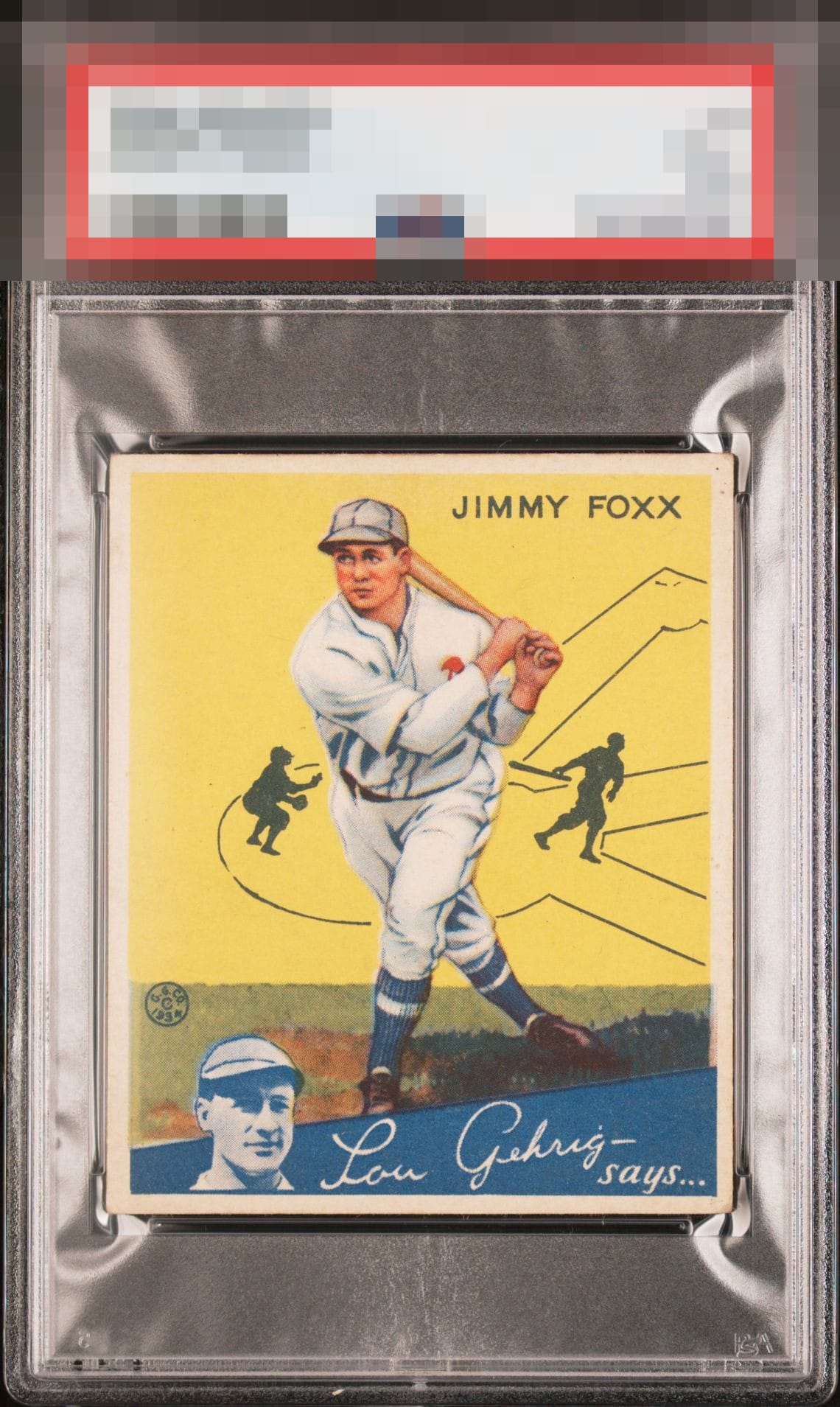
1934 Goudey Jimmy Foxx #1

Reviews & Discussions
13 total reviews

The flaws here are nearly inconsequential to me in terms of impact on beauty. Great example.

This one presents itself with real confidence. The border is crisp and behaves like it should, and the overall tone stays fairly white without that This card presents sharply. The border is crisp, the white stays clean, and the “F O X X” name is smooth with no distractions. The image has great clarity, and the yellow basepath lines pop nicely against the blue name area. Overall, excellent eye appeal with almost nothing to fault. Excellent card.

Very strong. Slight bit of room for improvement on the corners and edges, but they don't come too much nicer than this in the lower and mid grades.

Great looking card that's nicely centered. A couple of small marks in the upper right corner, and some minor corner wear are the only issues, but they don't hurt the appeal of this card by much.

Nice example. Couple of small dark spots on the upper left corner. Centering could be a touch better. Superb card.

This is a good lookin' card right here. Minor things I can cite yet nothing that tugs at my eye and can knock the eye appeal out of the A level.

A crisp and beautiful version of this card. The only item taking it out of god tier are the dots on the top right.

Stunning example. The bottom right corner is the only thing keeping it from GT status for me.

Card has nice eye appeal and colors are vibrant no obvious issues except discoloring from age and light wear on corners and edges. Presents very well
EyeQ+
EYEQ+ TROPHY CASE


Rating Distribution
13 total reviews
I see two print dots, one corner with a ding of wear, and maybe 1mm of centering. Now what does that all add up to? For me, it's the gap between GT and A+. These are flaws that really don't call out to me when staring at the card.