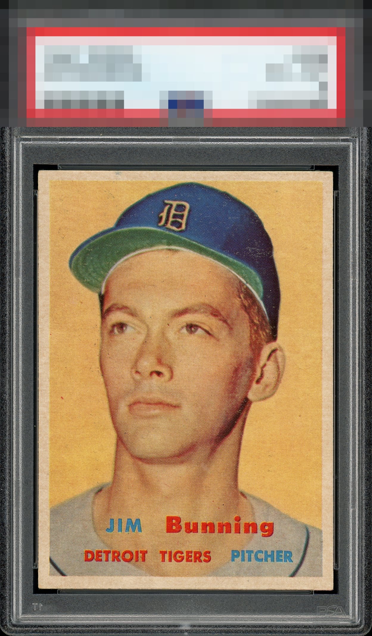
1957 Topps Jim Bunning #338

Reviews & Discussions
11 total reviews

Outstanding eye appeal. Looks almost dead, centered, and colors are strong as well. Beautiful example.

Centering and overall look are great. Print fuzz throughout the image, primarily visible on the cap. Colors are a bit muted. But really immaculate centering and strong corners.


Solid A to my eye with image issues the only drawback. Love the centering!

The centering really works for me even though it is a tick off. Image is solid. Weakness to the printing/color is all I can cite. Makes the top echelon for me.

There’s a lot I like about this. Focus, centering and surface all super close to the A tier for me, but fall just short. Nice overall eye appeal on this very fun 57t.

The centering is good (should be a little lower) but the main issue is the color. Looks like it sat in the sun a little too long.

The card seems lighter than it should. But with the background colors it actually works and I Like the look. The centering is nice but not great (top/bottom) the image is strong the background has some blemishes But overall the card works for me

Fairly well-centered but has some snow on the cap. The colors seem a bit light and doesn't pop.
EyeQ+
EYEQ+ TROPHY CASE


Rating Distribution
11 total reviews
To my lone cycloptic eye, this Bunning remains a stunning example, as the eye appeal absorbs the image and surface flaws with surprising grace.