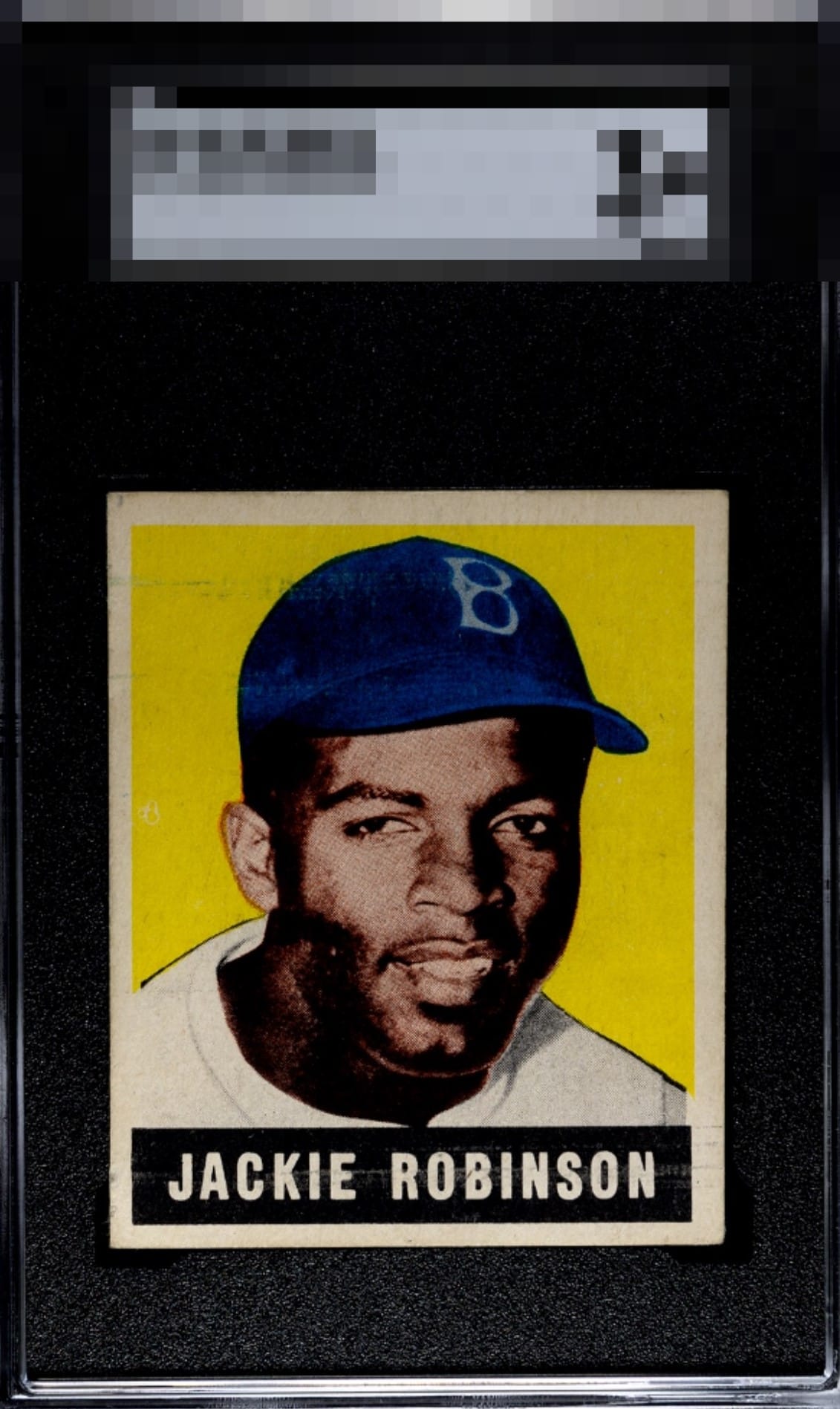
1949 Leaf Jackie Robinson #79

Reviews & Discussions
11 total reviews

Love how the colors read so deep and vibrant but the roller lines and centered distract.

Loving on the rich colors of this one. Pretty well centered too. The print lines do draw my eye a little bit.

The image looks great and the color is still bright. centering is a little off both ways but not terrible. The print lines do distract, but not to the point that the card can't still be enjoyed.

Interesting because the roller marks while there just don't dominate the viewing experience like the infamous print lines on a 1951 Mantle do. So the eye appeal is not as impacted here. Centering jumps out more to me.

Print lines and surface issues caught my attention but it doesn't dominate the overall presentation. Still a nice copy I'd be proud to own.

Nice bright colors on this example. Roller marks are evident but not too bad. Centering could be better.

The lines near the hat and the discoloring or aging of the borders is what I first see and cannot unsee them. The colors and image are good and help Prop up the card

The print lines don't dominate the card but I do keep circling back to them; when paired with centering the eye appeal is affected, yet not enough to get into the C Tier.

The color and focus of Jackie's face keep the eye appeal in the second tier for me. Printing lines by his name and in the top left do detract some alongside centering.
EyeQ+
EYEQ+ TROPHY CASE


Rating Distribution
11 total reviews
This Jackie survives my cycloptic scrutiny with its dignity very much intact. Flaws are detected that make only modest impact on visual appeal. Image focus and color depth provide ample counterweight to print lines and a centering shift.