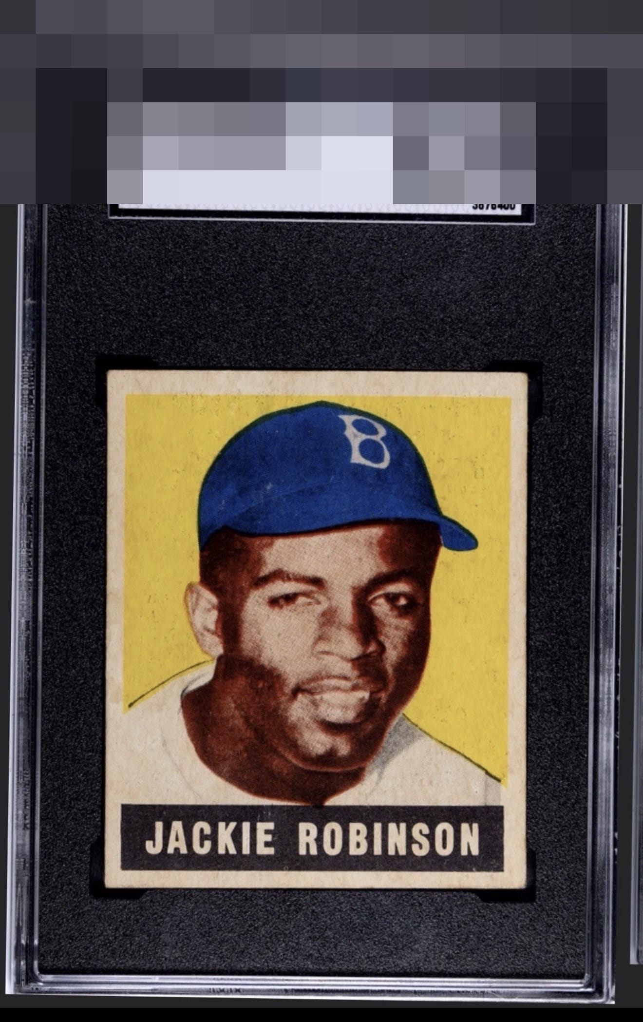
1948 Leaf Jackie Robinson #79
Reviews & Discussions
9 total reviews

Gorgeous example. Great centering, and the image is nicely focused. Very light print spots on the backdrop keep this from GT, but I wouldn’t feel the need to upgrade from this example if I owned it.

B/T centering and a few print dots in the yellow catches the eye a bit. Nice registration with deep colors. Minimal corner touches look great on the card. Very pretty example. Lucky owner.

really like the look of the card. The appeal is solid. there is surface wear that is noticeable if you look otherwise it blends in. Centering is an opportunity


Nice image and color, and the surface is cleaner than most. Centering isn't bad for the issue, but a little off top to bottom.

Even with some image blur, this copy appeals to me. I like the color and clean black of the nameplate. Centering barely misses my strikezone. Very good eye appeal.
EyeQ+

EYEQ+ TROPHY CASE


Rating Distribution
9 total reviews
Special example. Solid registration, attractive yellow background with a little bit of excess print that's common on 48L with very nice centering. Upper tier Jackie RC.