1948 Leaf Jackie Robinson #79
Reviews & Discussions
9 total reviews

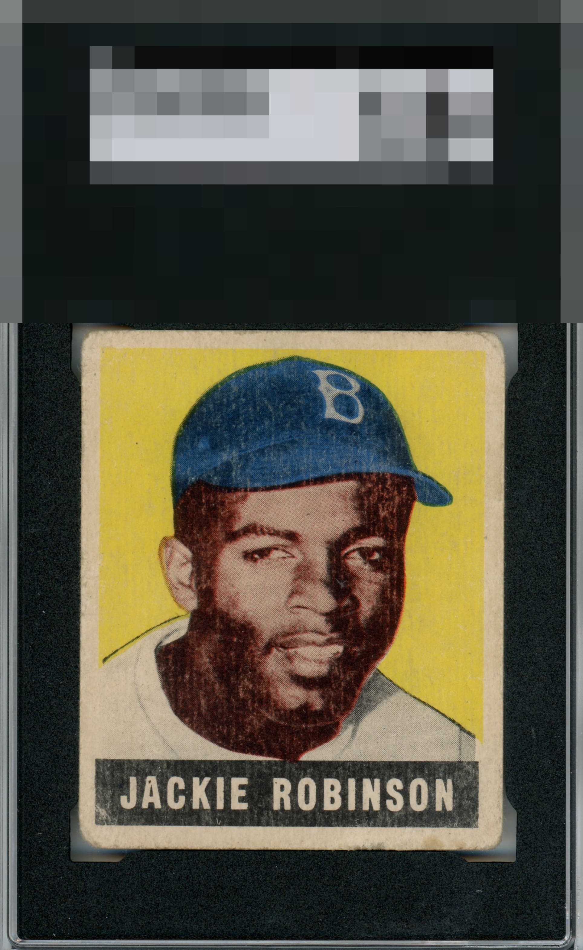
Great example for a low grade Robinson. The color is preserved and centering is well balanced. Offsetting that is the surface age / fading and rounding of corners. Yet I can still feel Jackie's gaze

Obvious surface & corners but looks largely wrinkle free. I wouldn’t fight anyone who wanted to put it in the next tier.

Centering and focus win me over to a large degree, with corners reaching the level where I do notice them. Some surface fading also impacts eye appeal.

Just general wear that adds up and impacts eye appeal, though retains presentability as no one flaw stands out and destroys it.

What looks like surface wear does catch my eye but this is still a nice copy that hits the eye nicely.

The colors of the image doesn't pop. Main issue is the snow and surface wear on the face and the black name box is cloudy. Still a very nice card and well-framed.

The card has alot of condition issues on the surface of the card, on the borders, and directly on the image. The centering is also off. But the issues are fairly even thru out the card from discoloration etc that it actually blends in to make it like the card should be the way it is. As a Result it actually presents pretty well.

Nicely centered, corners and some surface wear bring grade down a little.

EyeQ+
EYEQ+ TROPHY CASE


Rating Distribution
9 total reviews
Well -centered :)