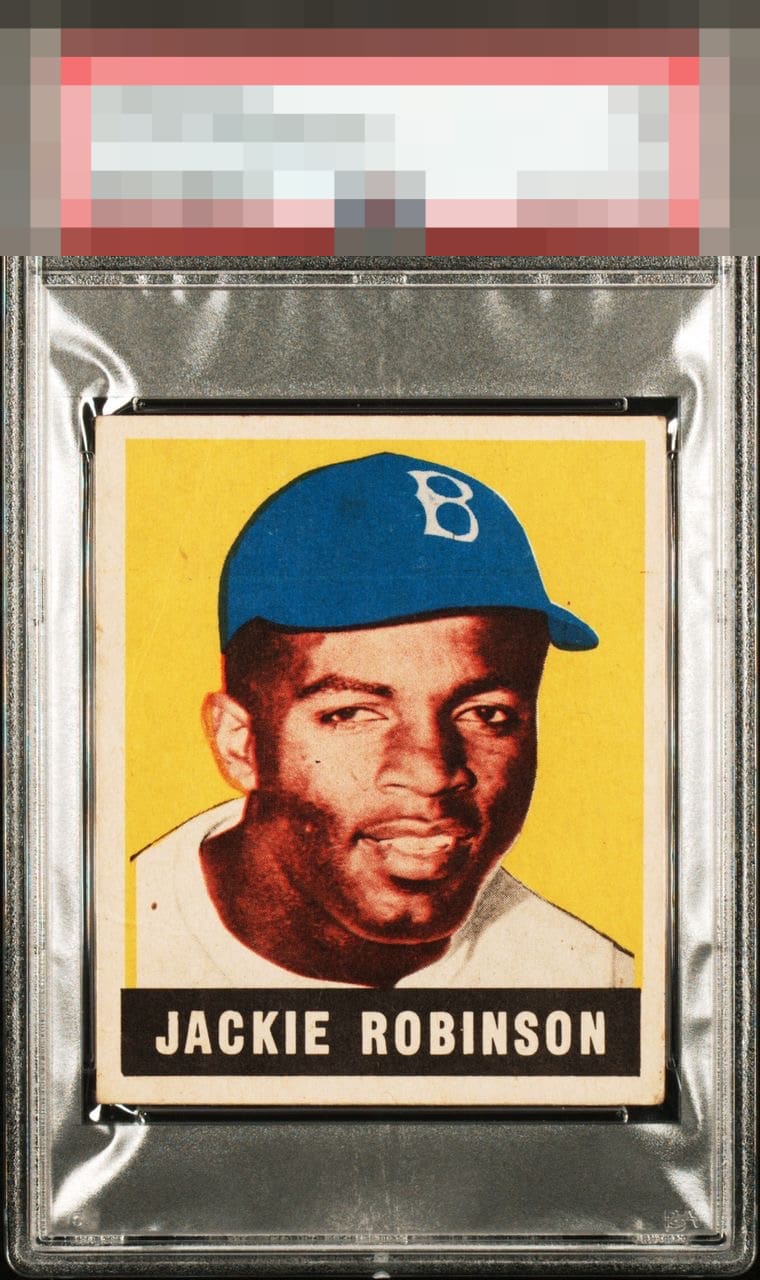
1948 Leaf Jackie Robinson #79

Reviews & Discussions
24 total reviews

Very strong in all aspects often considered... Just centering and clean corners away from A territory eye appeal

Nice copy for the grade. Excellent registration and bold color. The poor scan quality likely obscures some creasing but I can see one in the lower left for sure. And there is a horizontal print defect running through his hat. Centering is great at the bottom but shifted right at the top.


Front looks great from colors popping and centering but the back is the issue


Excellent Jackie. This is the most difficult icon-level card for the hobby to get consensus eye appeal characteristics on. Those damn printers Leaf Gum Co. stole from some landfill to use for my favorite set. For me, I love the Yellow and Blue - they jump off the screen. The face is too red-toned for my liking to score higher, but others will disagree. Centering is elite, though I don't prioritize that in this set. A-.


It is simply hard to imagine a 1.5 looking better than this. I could nit pick the centering and black dot on his shoulder, but not on a 1.5— on an 8, sure. In terms of bang for the buck, or punching above its weight, this card delivers. And then some.

Incredible copy in terms of centering, corners and registration. Bold color as well. Improved centering and the dot on his left shoulder are the only thing keeping this from being an A+ or even God tier for me.
EyeQ+
EYEQ+ TROPHY CASE

Rating Distribution
24 total reviews
Centering shift is the only problem for me here on a card that I have now stared at for minutes and cannot see any other flaw that bugs my eye.