1955 Topps Jackie Robinson #50
1 / 2

💬
Reviews & Discussions
7 total reviews


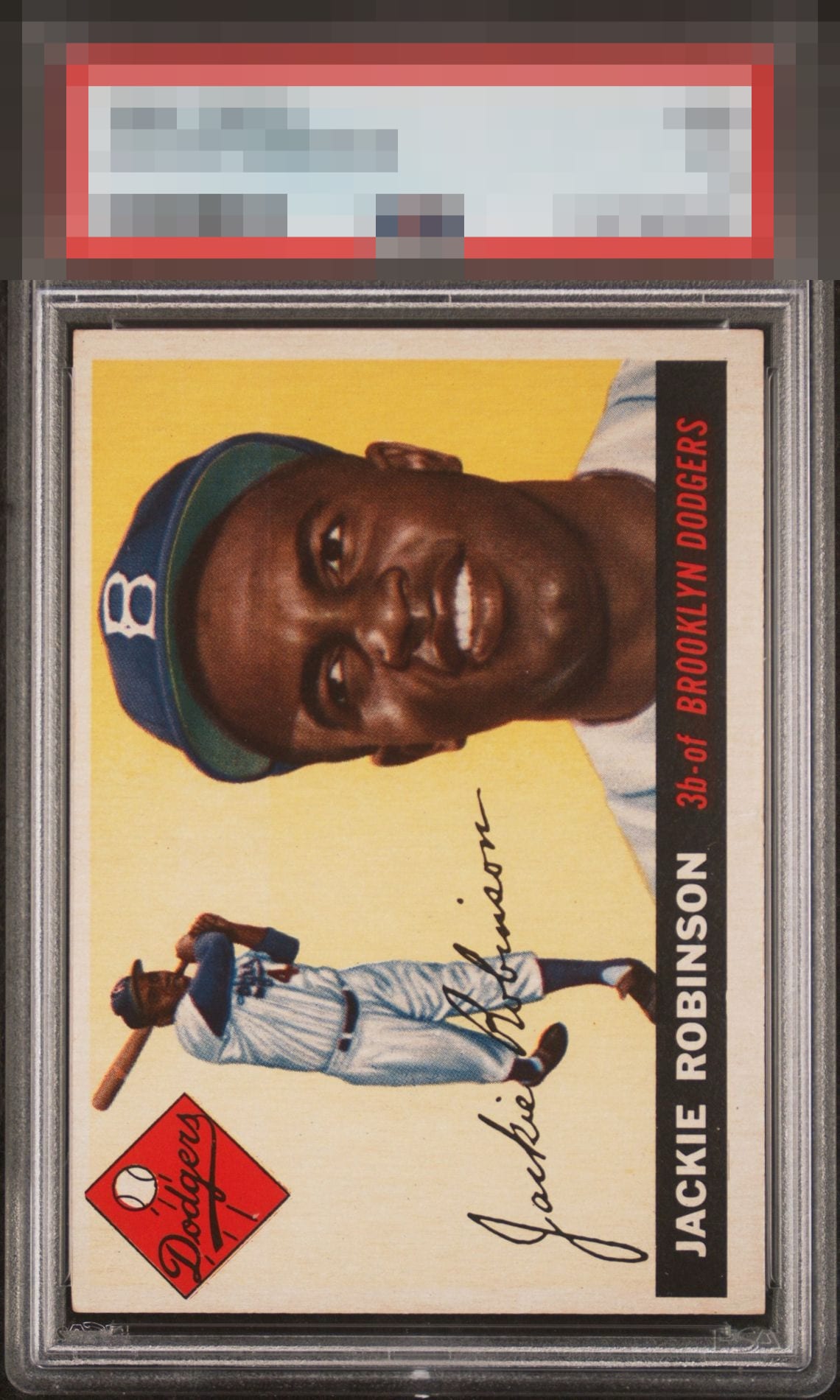
I really like the look of the image as it stands out. The colors are good and provide nice contrast. The card is clean what holds it back is the centering is off both T/B and L/R and that effects how it is framed and the overall Eye Appeal


Centering is the one aspect that impacts eye appeal. Great image and clean of any PD in both the yellow and black areas, which I look for in this card.

6 reviews
1 review
EyeQ+
--
Global Population
9
POPULATION ACROSS ALL GRADES AND GRADING COMPANIES
Global Eye Rank
—
No Eye Q+ score
Population in Grade
1
POPULATION IN THIS GRADE ACROSS ALL GRADING COMPANIES
Eye Rank in Grade
—
No Eye Q+ score
EYEQ+ TROPHY CASE

GLOBAL

IN-GRADE
Trophies appear here when earned.
📊
Rating Distribution
7 total reviews
G
0%
A+
0%
A
0%
A-
0%
B+
3 ratings
50%
3
B
3 ratings
50%
3
B-
0%
C+
0%
C
0%
C-
0%
D+
0%
D
0%
D-
0%
F
0%
Bold, centering shift & corners hold it back from higher tier