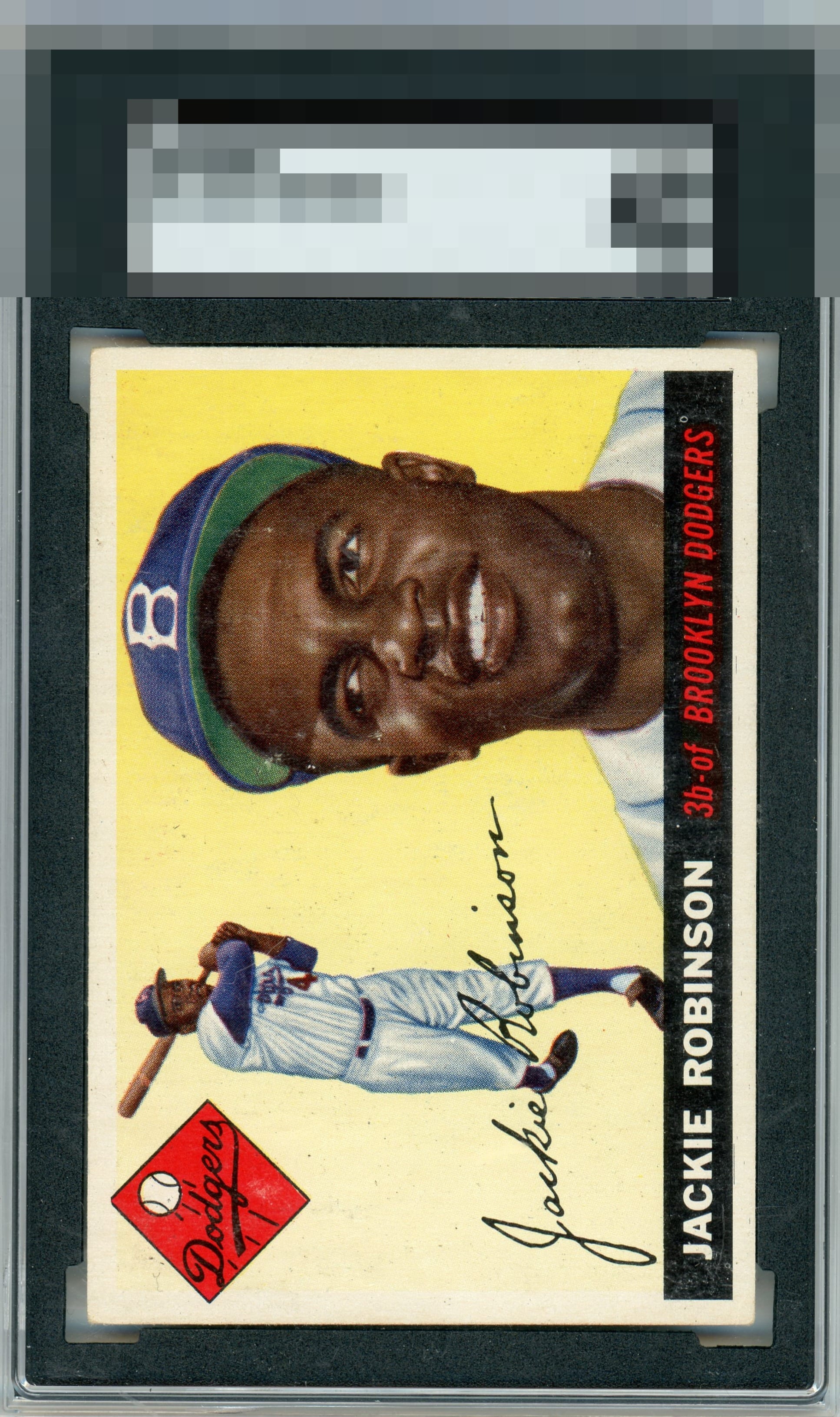
1955 Topps Jackie Robinson #50
1 / 2
Click to enlarge

💬
Reviews & Discussions
9 total reviews

Centering is A+ and lots of small surface imperfections dampen eye appeal a bit. The fish eye at the far right end of the black box nags my eye the most of the flaws. That centering though!


Oh my. This card is massaging the part of my brain that insists on perfect, even framing of an image. The minor PD would not be noticed or cared about by me were this card in my wall display, so... A+ it is.


nice size borders and good centering. biggest issue on the borders is on the left side(if horizontal) is that the discoloring actually causing the border to blend into the card. The card itself has really nice colors and image is solid. Love it

Locked
2 reviews
EyeQ+
134.0
Global Population
13
POPULATION ACROSS ALL GRADES AND GRADING COMPANIES
Global Eye Rank
#6
Population in Grade
5
POPULATION IN THIS GRADE ACROSS ALL GRADING COMPANIES
Eye Rank in Grade
#3
EYEQ+ TROPHY CASE
6th Place
GLOBAL
3rd Place
IN-GRADE
📊
Rating Distribution
9 total reviews
G
0%
A+
1 rating
14%
1
A
0%
A-
4 ratings
57%
4
B+
1 rating
14%
1
B
0%
B-
1 rating
14%
1
C+
0%
C
0%
C-
0%
D+
0%
D
0%
D-
0%
F
0%
This still looks excellent. A little surface wear shows, yet the image remains crisp.