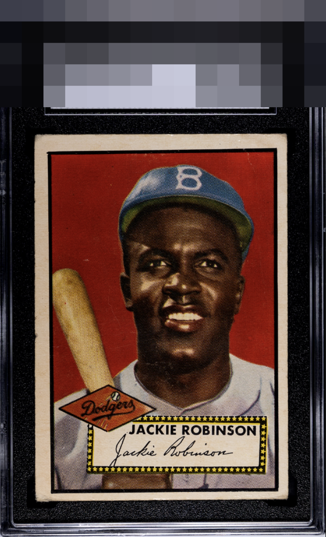
1952 Topps Jackie Robinson #312
1 / 2
Click to enlarge
💬
Reviews & Discussions
4 total reviews

Notable R/L centering shift as well as a significant tilt but....., the colors and image are bold with just a few surface scuffs catching the eye. I only dream of owning such a specimen.

really love the image and the colors. Little to much surface wear and light creases for my liking and the centering is off but it is a card i would proudly own and display


4 of 7 reviews

0 reviews
EyeQ+
--
Global Population
17
POPULATION ACROSS ALL GRADES AND GRADING COMPANIES
Global Eye Rank
—
No Eye Q+ score
Population in Grade
1
POPULATION IN THIS GRADE AND GRADING COMPANY
Eye Rank in Grade
—
No Eye Q+ score
EYEQ+ TROPHY CASE

GLOBAL

IN-GRADE
Trophies appear here when earned.
📊
Rating Distribution
4 total reviews
G
0%
A+
0%
A
0%
A-
1 rating
25%
1
B+
2 ratings
50%
2
B
1 rating
25%
1
B-
0%
C+
0%
C
0%
C-
0%
D+
0%
D
0%
D-
0%
F
0%
The image is top tier while centering impacts the eye appeal. The deep red comes in and pushes the aesthetic to earn the plus.