1952 Topps Jackie Robinson #312

Reviews & Discussions
10 total reviews

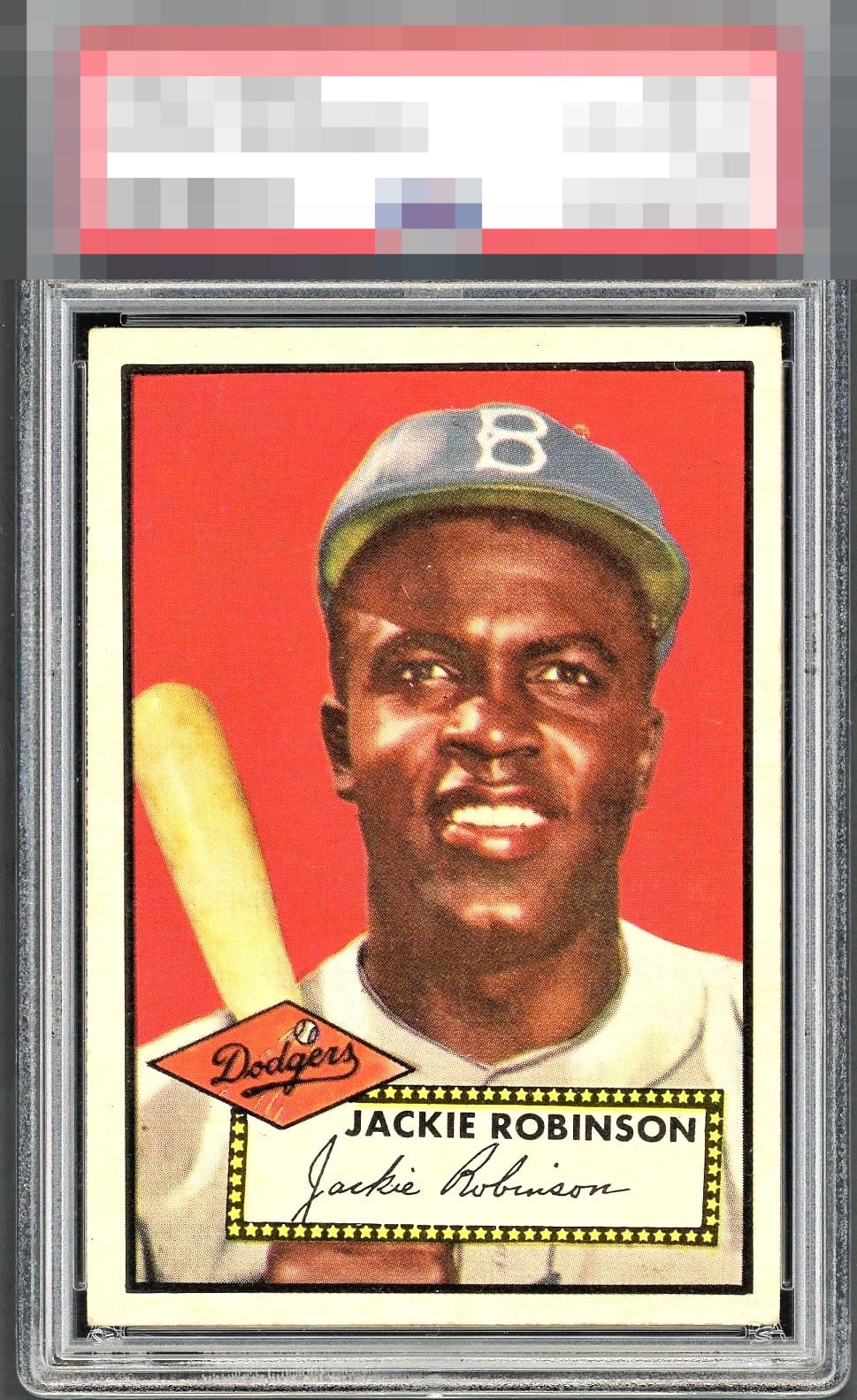
The lack of tilt on the top border is so rare. This is elite. If it were just a tick better centered L/R it’d be GT for me. Incredible card.


Love this example. Bright, with nice white borders and very little of the angle you usually see. Few little things keep it at A, but I'm all in.

Usually this centering would land an A- from this collector but the usual angle of the top border is the flattest I have ever seen, which bumps the eye appeal up!

Nice copy here w/ strong color and eye appeal. What looks like minor surface wear and centering are my only notes.


The flat top border, meaning no tilt, is a standout feature that boosts eye appeal for me. Centering is the flaw but it does in no way spoil the party.

Side centering bumps the eye appeal yet otherwise no flaws grab me.

love the look of the card and the border sizes jump off the page. The centering is off but not dramatically The colors and image are solid with minor surface wear like the white above hat but overall a Great Card

EyeQ+
EYEQ+ TROPHY CASE


Rating Distribution
10 total reviews
This example is so visually strong that I have temporarily postponed humanity’s extinction. The flaw of centering would normally, per my exacting standards, preclude such a lofty badge assessment. However, the other qualities of this card shine through and counter that one flaw to a powerful extent. cc: Skynet.