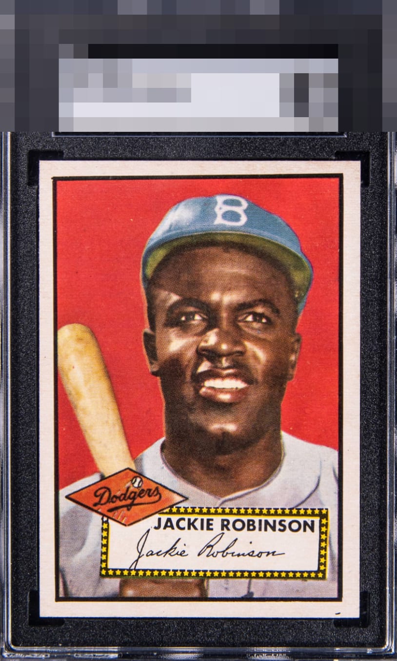
1952 Topps Jackie Robinson #312
Reviews & Discussions
12 total reviews

As I have said in some other reviews I have written, I am one to trade some corner sharpness for less tilt and better centering, and this card is a good example of that. It does please the eye very much, yet that tilt (there on all Jackies I have seen) is heavy. There are a few examples in the compare feature that are much prettier to my eye as the tilt across the top is less on those cards.

Wow.. Incredible card. Would be GT with out the top right corner tilt.

Extreme tilt but the focus of Jackie with the bright red background are outstanding. Sharp corners and clean borders aside from the bottom speck give this a high technical grade. Well above average eye appeal for sure.

Incredible example with the slight tilt and a little off centered bringing it out of god tier.

A beautiful, vibrant card with superb print registration and a gorgeous, punchy red. The corners are excellent. Centering is off and the card sits slightly tilted; the name placard and the Dodgers inside the diamond show a bit of roughness, but those are minor blemishes on an otherwise striking 1952 Topps card.

The slant is the central image itself. The card is not miscut. All type 1 Jackies should look like this. Stellar example overall. Centering shifts keep it from higher grade for me, that's all though.

Beautiful card. The colors POP, the image and details are strong and nice bold and bright borders. Card has a barely noticeable tilt that holds it back from the next level Wow and Wow

The trade of great registration, colors, corners and surface for a more extreme tilt to the card exists here. It all depends I suppose on what you value most in a card. I’m not sure I’ve seen a nicer looking example of this card — minus the extreme tilt.

This is a tough one for me. Maybe I am being too harsh, because I concede the card is bright, sharp, focused, all of that. Yet that top slant—which I know all 52T Jackies exhibit, to varying degrees—is just so extreme on this one. That angle is steep. Were it a few degrees flatter, we are talking A+ or GT. But I must be honest, and to my eye, that degree of top slant would gnaw at me each time I looked at it, and therefore dampen the visual enjoyment.
EyeQ+
EYEQ+ TROPHY CASE

Rating Distribution
12 total reviews
I may be on the low-harsh side on this card but that centering makes me want to send the card to a chiropractor; it is like one shoulder is jacked up way too high. The card is so pretty in all other arenas, for sure. The centering or better said tilt just puts a ceiling on the eye appeal to me.