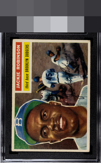
1956 Topps Jackie Robinson #30
1 / 2
Click to enlarge

💬
Reviews & Discussions
4 total reviews

little to much toning for my liking and corner wear. But the Color is solid and main image jumps off the page

This card has exactly the kind of wear that I find myself most lenient on, as the image and even framing please my eye. No loud distractions. Slips past the velvet rope into my top tier of looks.

3 of 7 reviews
1 review
EyeQ+
--
Global Population
17
POPULATION ACROSS ALL GRADES AND GRADING COMPANIES
Global Eye Rank
—
No Eye Q+ score
Population in Grade
8
POPULATION IN THIS GRADE ACROSS ALL GRADING COMPANIES
Eye Rank in Grade
—
No Eye Q+ score
EYEQ+ TROPHY CASE

GLOBAL

IN-GRADE
Trophies appear here when earned.
📊
Rating Distribution
4 total reviews
G
0%
A+
0%
A
0%
A-
1 rating
33%
1
B+
2 ratings
67%
2
B
0%
B-
0%
C+
0%
C
0%
C-
0%
D+
0%
D
0%
D-
0%
F
0%
Great colors with pretty good centering. Light toning along the borders.