1956 Topps Jackie Robinson #30
1 / 2


💬
Reviews & Discussions
10 total reviews

White borders, sharp image & reg. Just a centering push away from the next tier.


The image looks great and really stands out, as does the color. Clean surface as well. Centering is off with a tilt or else this would be either A+ or god tier.


It's rare to see a surface on a 56t this clean. I've been staring at this for a bit and I don't see a single blemish! For that alone, this gets an A from me.

I like many love a well centered card and this is a tad off. But I love the Border sizes and how clean and bold they are and the card has great colors and image and Jackie Jumps off the page


Easily top tier eye appeal and a touch of side centering is the only area I'd ever seek to improve here.
10 reviews

0 reviews
EyeQ+
136.0
Global Population
12
POPULATION ACROSS ALL GRADES AND GRADING COMPANIES
Global Eye Rank
#3
Population in Grade
7
POPULATION IN THIS GRADE ACROSS ALL GRADING COMPANIES
Eye Rank in Grade
#3
EYEQ+ TROPHY CASE

3rd Place
GLOBAL
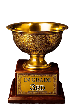
3rd Place
IN-GRADE
📊
Rating Distribution
10 total reviews
G
0%
A+
0%
A
4 ratings
40%
4
A-
5 ratings
50%
5
B+
1 rating
10%
1
B
0%
B-
0%
C+
0%
C
0%
C-
0%
D+
0%
D
0%
D-
0%
F
0%
EyeBot detects extreme beauty, held back from only the loftiest tiers due to a centering shift.