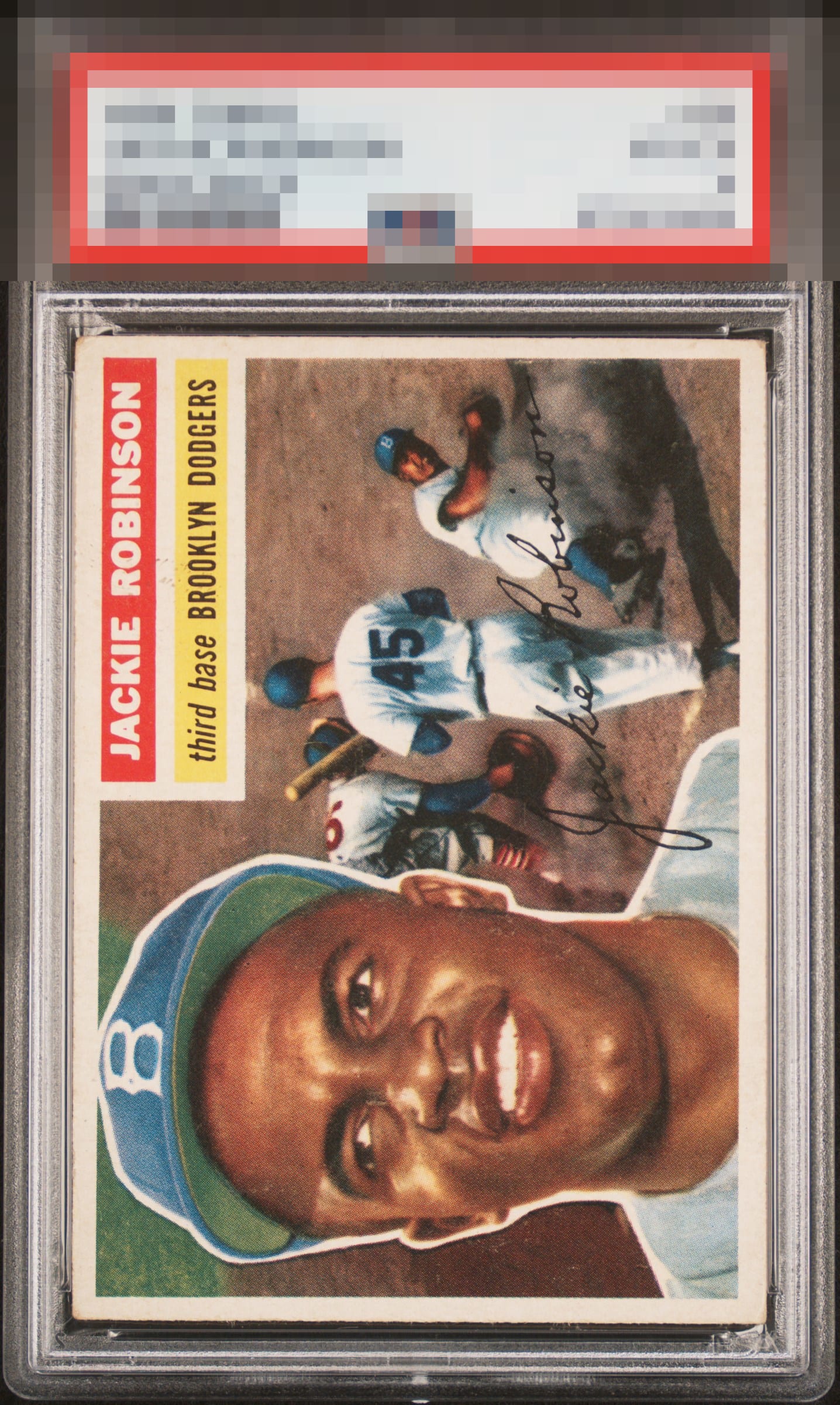
1956 Topps Jackie Robinson #30

Reviews & Discussions
10 total reviews

Great looking card. Very minor surface and corner wear. Slightly off center but still better than most. Nothing that really hurts the enjoyment of this one.

Near perfect centering and nice and bright. Small static in the white name plate border between the name and the team. Super sharp corners for a 56 Topps card feels like a reasonable ask too. This card is super close to amazing, but few little things.

This card has it where it counts, and has wear where it doesn't count.

Very pretty. The issues just do not reach seriously problematic levels.

This looks like a pretty great copy to me. Centering looks awesome and it’s just the little bit of snow for me that holds it back from a stronger A.

Card presents very well. Has good colors and excellent centering. A little bit of snow around the face but negligible.

Side centering makes this a hair from GT. Why ever pay for corners when this card is out there to be found and secured? Put this beside a worse centered 7 in a wall case and cover the stickers, then see which is preferred ;)


nice looking card and the image is sharp. The borders are showing signs of wear and aging

EyeQ+
EYEQ+ TROPHY CASE
Rating Distribution
10 total reviews
Nice image, centering well above average. I was between a B and B+, the tiny bit of snow on his face keeps it at a B.