1956 Topps Jackie Robinson #30

Reviews & Discussions
14 total reviews


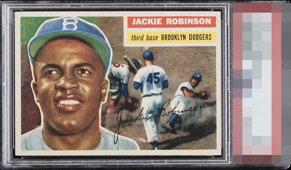
In this particular copy, the centering is commendable, though one can observe a noticeable shift toward the right side of the card. There's a subtle tilt that slightly affects the alignment, particularly around the upper right corner where the Jackie Robinson nameplate resides. It's not entirely straight, lending the card a touch of character but also a slight imperfection. As for the imagery, it does appear a bit washed a bit, yet it remains a very respectable copy overall. While it may not achieve absolute perfection, it certainly stands as a piece with its own charm and solid quality, worthy of appreciation.

💥 GOD Nothing stands out.. Just a perfect example with off the charts eye appeal.


The key for me on 56 Jackie's is that his face doesn't appear faded or too red-toned. This one has the goods. And is framed spectacularly. I see nothing that keeps me from handing a wad of cash to a dealer at the national for whatever he's asking.

Textbook God Tier card. At first glance, you think, "This looks perfect to my eye." After another 30 seconds of staring... you think the same thing. Punches way, way above its weight.

So much to love about this example that looks more like an 8 or a 9 than a 5.5. Throw in the fact that this is the rarer grey back version and this is a top eye appeal copy among all grades without a doubt.
EyeQ+
EYEQ+ TROPHY CASE


Rating Distribution
14 total reviews
Beautiful card a smidge off center.