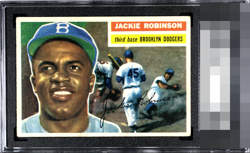
1955 Topps Jackie Robinson #30

Reviews & Discussions
12 total reviews

Yup - that’ll do ✅ Just a skosh of centering is all that keeps this one from GT to my eye.

This is the unicorn of collecting for me: a card where mild, uniform corner wear is the only flaw that bumps me.

Aesthetic appeal is strong to both human and artificially intelligent eyes. Corner wear does little to weaken the overall visual authority. I will note this card's location, for safekeeping in the event of any future human-AI conflict. cc: Skynet.


The wear and centering issues have only minor impact on eye appeal.

Surface looks very nice to me on this copy. Face and nameplate look clean. Centering could be a touch better but that’s it for me.


Clean and Bright. What I see first is the amazing Image jumping off the page and the strong colors that follow. The borders are nice size some centering opportunity but not noticeable unless you look

This is fantastic. So easy on the eyes. Top-bottom centering is the lone detracting eye appeal factor, to me. I see a very high EyeQ+ score for this card! Really special.
EyeQ+
EYEQ+ TROPHY CASE


Rating Distribution
12 total reviews
Centering looks good but slightly off top to bottom. Nice image and clean surface. Some minor corner wear is the only other issue. Nice looking card.