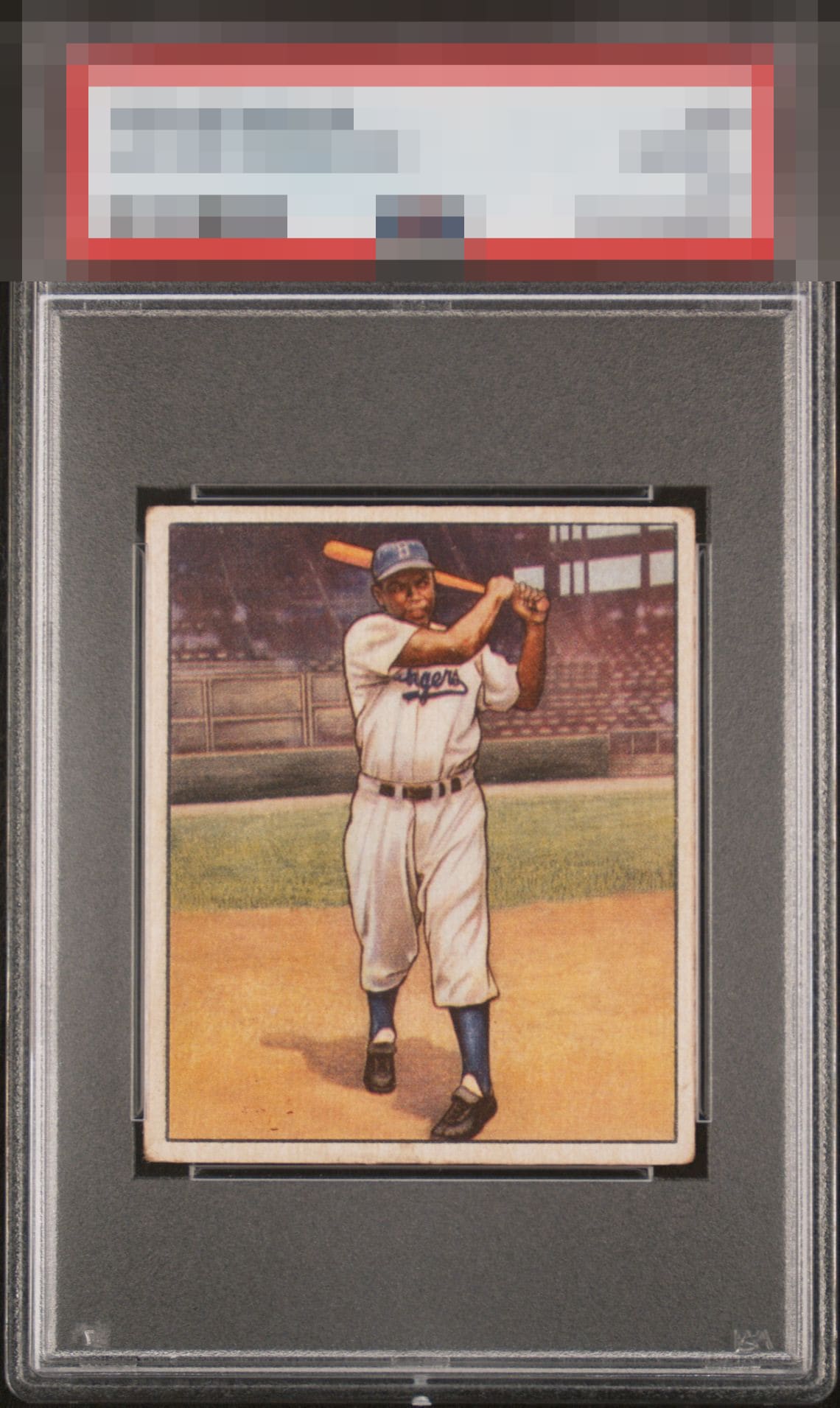
1950 Bowman Jackie Robinson #22

Reviews & Discussions
12 total reviews


Color and registration are the standouts here! The rounded corners distract my eyes a bit and centering could be better. Still a beauty!

Centering is a little off both ways, but better than most. The corners are rounded, but the rest of the card looks great. This is the kind of low to mid grade example I look for.

It's a little off centered left to right and the registration could be a little clearer but this is an amazing card and a great example for the grade.

Better than the slabbed grade and stands out as a good mid level card. The colors and the image is good with no major issues. THe Border holds it back as it does not POP has some discoloration and wear and is off center

Strong B eye appeal on a card that over delivers. Were centering OR the corners improved, could crack A-. Nice card!

This is the kind of card I look for at shows. In real life, when you step back and look at a card like this in hand or in a display or easel-style desk stand, it looks so good. Centering is a touch off to the right is the main flaw for me. Over delivers on beauty for sure.

Punches way above its weight! Nearly dead on centering, great surface, and good focus.
EyeQ+
EYEQ+ TROPHY CASE


Rating Distribution
12 total reviews
Centering = A- Surface/ Registration = A Edge/ Corners = A-