1953 Topps Jackie Robinson #1

Reviews & Discussions
10 total reviews

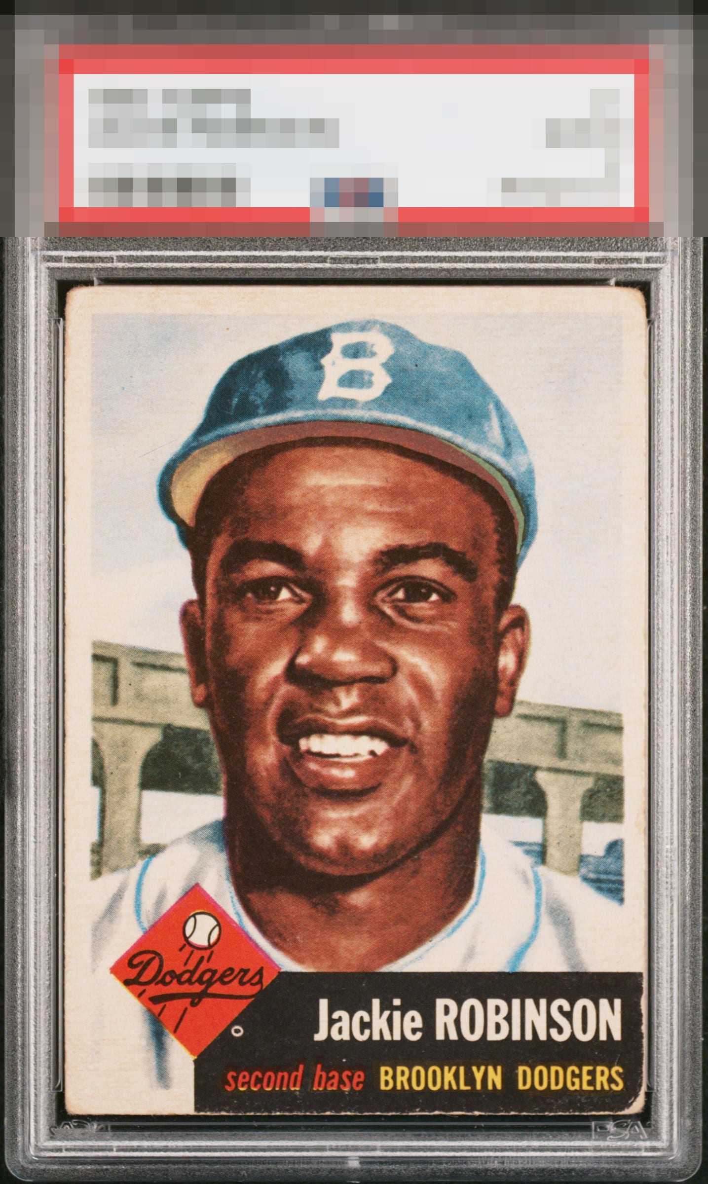
This Robinson has a wonderfully balanced overall presentation. The centering is especially appealing, giving the card a natural symmetry that immediately settles the eye. The color remains consistent throughout, the Dodgers logo presents strongly, and the corners wear evenly enough that the card still feels visually composed despite its age. The surface wear, softened corners, and slight fading in color clearly show that the card has lived a life. Those are limitations yet also part of the card’s charm and authenticity. Rather than feeling tired, the card feels honest. The result is a Jackie that doesn't overwhelm with sharpness or gloss, but still carries warmth, balance, and an unmistakably vintage presence.

Well framed, good image if a little light with some obvious rounding

this is one of my favorite sets. This card has nice eye appeal from the colors and the main image. Condition issues related to edges, corners, and borders holds it back especially and sadly do the the damage on the black box that stands out

Reminds me a lot of my ’53T Mantle. For me, while the corners and nameplate fall a bit short, the image and centering carry it. Beauty.

Image of Jackie is spot on and well-centered. A bit too much wear on the bottom right edge in the black. The fisheye next to the Dodgers logo does distract a bit.

Corners are pretty beat but the sharp image and above average centering carry the day. Great low grade copy.

Well centered with a nice image. Corner wear and some edge wear around the black box keeps this just below A tier, but a nice lower grade example that I would buy.

Fastball down the middle of eye appeal here. The main image can be enjoyed without distraction, and honest corner wear is the flaw I most easily shrug off and tolerate. The black edge is quite strong.

I can see guys that value corners disagreeing with my assessment but the centering and image are phenomenal. When a card is centered this well it really draws the eye away from the edges and corners imo.

EyeQ+
EYEQ+ TROPHY CASE


Rating Distribution
10 total reviews
My kind of card, beautifully centered. Has other issues but they don't bother me.