1953 Topps Jackie Robinson #1

Reviews & Discussions
11 total reviews

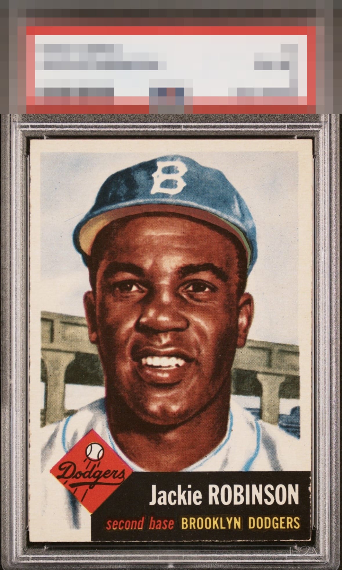
Very solid example. Centering has a little room for improvement but otherwise great.

The central image carries the day here as it really holds my attention, and to a great extent overcomes the centering shift. I am also a fan of the nearly perfect black edges and corner.


Great looking card. Centering is my only note here but it’s hidden well.

Although the centering is slightly off and there’s a little bit of chipping on the black box, this card is a beauty. Very high eye appeal for me on this one. Edit: looks like the picture was updated after I first reviewed it. The new picture makes me go to an A instead of GT.

The image looks great and really stands out. Centering is off a little left to right. The chipping around the black box is the only other issue.


Great looking card and it has nice sized and clean borders. This is a card I would love to own as I really like the strong image and the colors really POP to me. IT is held back from greatness most by the nicks on the edges and borders on the bottom blackbox as it really noticeable against the black

Excellent color and image. The slight tilt and centering shift to the left is the only detraction.
EyeQ+
EYEQ+ TROPHY CASE


Rating Distribution
11 total reviews
Frame is offcenter. I think the scanner setting is saturating color a bit here, and so it appears more red-tinted than it likely is in person.