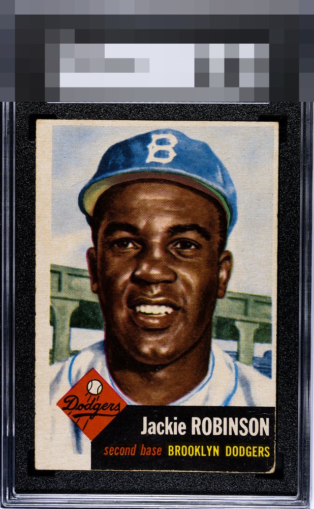
1953 Topps Jackie Robinson #1

Reviews & Discussions
10 total reviews

Obvious OC with some whitening on the bottom black. The image and color are great.

I can get over the bottom right corner, but the centering is a bridge to far.

Points for color & image quality but obviously OC with visible chipped corner


Centering is too extreme to overlook here. The roughest corner being the back lower right isn't a help either.

C for centering as that is my key issue here. That lower right corner is secondary and with a centering improvement this would land in the B Tier to me.


The first thing I see is lack of borders and off centering and then I see the damage of the edges that make the black box at the bottom stand out for the wrong reasons. The colors remain strong and the image is solid. Good card with limitations

I like the colors and image. Main issue is the centering and too much wear on the bottom right corner.

EyeQ+
EYEQ+ TROPHY CASE


Rating Distribution
10 total reviews
Nice image and color but there is some wear about the black box and the lower right corner. Centering is the main issue off both ways with some tilt.