1953 Topps Jackie Robinson #1
1 / 2

Click to enlarge

💬
Reviews & Discussions
8 total reviews

Nice image of his head, but the centering, tilt, corners, and surface issues to the left of his mouth and to the left of teh J in Jackie, detract.


The scuff by his first name is the one flaw that leaps out, and the centering. Yet the eye appeal remains workable overall as nothing mars his image.

Always love these card and how the face is oversized and feels like they are coming out of the card. This card has surface issues, border size issues, and overall condition issues BUT The main image and the Background around it stand out and Stand Tall and I love the Look

Surface, corners, and centering all have their issues but the colors are good.
Locked
1 review
EyeQ+
135.0
Global Population
15
POPULATION ACROSS ALL GRADES AND GRADING COMPANIES
Global Eye Rank
#7
Population in Grade
1
POPULATION IN THIS GRADE ACROSS ALL GRADING COMPANIES
Eye Rank in Grade
#1
EYEQ+ TROPHY CASE
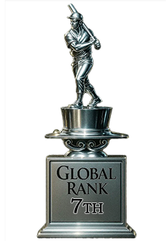
7th Place
GLOBAL

1st Place
IN-GRADE
📊
Rating Distribution
8 total reviews
G
0%
A+
0%
A
0%
A-
0%
B+
1 rating
14%
1
B
0%
B-
3 ratings
43%
3
C+
2 ratings
29%
2
C
0%
C-
1 rating
14%
1
D+
0%
D
0%
D-
0%
F
0%
A solid, average looking 73 year-old baseball card that allows for enjoyment of the image without any major flaw that would make it a hard pass for me. I shop for cards like this when the price jumps too high for me on the super pretty ones. The key is finding the face and surface just like this Jackie. Centering and that scuff in the black by his name would be what I'd hope to avoid, and instead have some back damage or even one worse corner.