1954 Topps Henry Aaron #128
1 / 2

💬
Reviews & Discussions
7 total reviews


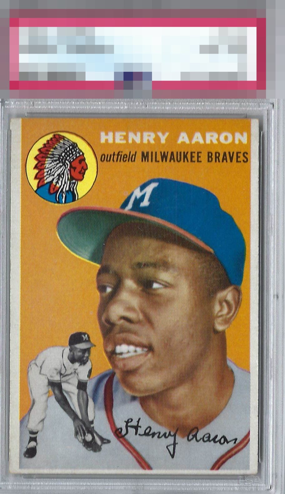
great color! centering and minor surface flaws hold this back a bit.


Really nice looking card and those borders are better centered than most but the uneven sized makes it feel unbalanced. The colors and the image are solid with minor surface issues But overall really easy to enjoy and great to show off to others

A couple of fisheyes in the orange. Off-centered. The overall image of Hank looks very good.

Sharp-looking in all respects except for centering and a small registration shift visible in the cap brim and team logo circle. The centering factors in most.
7 reviews

0 reviews
EyeQ+
--
Global Population
27
POPULATION ACROSS ALL GRADES AND GRADING COMPANIES
Global Eye Rank
—
No Eye Q+ score
Population in Grade
2
POPULATION IN THIS GRADE ACROSS ALL GRADING COMPANIES
Eye Rank in Grade
—
No Eye Q+ score
EYEQ+ TROPHY CASE

GLOBAL

IN-GRADE
Trophies appear here when earned.
📊
Rating Distribution
7 total reviews
G
0%
A+
0%
A
0%
A-
0%
B+
4 ratings
57%
4
B
3 ratings
43%
3
B-
0%
C+
0%
C
0%
C-
0%
D+
0%
D
0%
D-
0%
F
0%
Good eye appeal with centering the one flaw that makes an impact.